Wiki
Clone wikiGreat Gadgets Add-On / Home
Great Gadgets
On this page:
- Great Gadgets
- What is Great Gadgets
- Gadgets Offered
- How to use
- Gadgets Description
- Team Wallboard Gadget
- Release Burnup Burndown Chart
- Sprint Burnup Burndown Chart
- Team Velocity Gadget
- Cumulative Flow Diagram Gadget
- Kanban Velocity Gadget
- Cycle Time Trend Gadget
- Control Chart Gadget
- Histogram Chart Gadget
- WIP Aging Chart Gadget
- WIP Run Chart Gadget
- Work Breakdown Structure (WBS) Gadget
- Issue Filter Formula Gadget
- Advanced Issue Filter Formula Gadget
- Countdown Gadget
- Regional Clock Gadget
- Migration Steps
- Rate Limits
See also:
- StonikByte Blog
- Cross-project release burndown chart in Jira with Great Gadgets app
- How to track the team velocity in Kanban with Great Gadgets app for Jira
- A powerful Reported vs Done chart for Jira dashboards
- 7 gadgets for a powerful Scrum dashboard in Jira
- 11 “must-have” gadgets for any Kanban dashboard in Jira
- Tracking an agile project that uses time estimates with Great Gadgets for Jira
- How to track multi-team or scaled-agile projects (such as SAFe®) in Jira with Great Gadgets app
What is Great Gadgets
Great Gadgets is an app for Jira and Confluence that offers a suite of Jira dashboard gadgets and Confluence macros that you can add to your Jira dashboards or Confluence pages for making them more powerful and this way to improve the efficiency and effectiveness of your team.
The app exists on Atlassian Marketplace in multiple listings, as it follows:
- Great Gadgets for Jira Cloud - represents the app version that is compatible with Jira Cloud. The gadgets offered by this app can be used in Jira Cloud dashboards.
- Great Gadgets for Confluence Cloud - represents the app version that is compatible with Confluence Cloud. The gadgets offered by this app are actually Confluence macros and they can be used in Confluence pages. Most of the gadgets offered displays data from Jira, so Jira Cloud is also required for this app to work. You can use this app in combination with Great Gadgets for Jira Cloud or as a stand-alone app, but in this case you must have the StonikByte Connector for Jira Cloud free app installed in your Jira Cloud instance in order to allow the Confluence app to retrieve the necessary data from the Jira Cloud instance.
- Great Gadgets for Jira Server - represents the app version compatible with Jira Server and Jira Data Center. The gadgets offered by this app can be used in Jira dashboards and they can be also imported as macros in Confluence Server and Confluence Data Center.
Gadgets Offered
The current version of Great Gadgets includes the following gadgets.
| Gadget | Category | Description |
|---|---|---|
| Agile, Project Management | Team Wallboard Gadget Displays the wallboard with the work items from a specified agile board. Use this gadget to see what your team is working on. Read More... | |
| Agile, Project Management | Release Burnup Burndown Chart Gadget Displays the Burnup or Burndown chart for a Jira issue filter representing your release scope. Use this gadget to track the progress of your project in an agile manner. Read More... | |
| Agile, Project Management | Sprint Burnup Burndown Chart Gadget Displays the Burnup or Burndown Chart for a selected Agile sprint. Use this gadget to track the progress of your Agile team during the sprint. Read More... | |
| Agile, Project Management | Team Velocity Gadget Calculates and displays the current average velocity of the Agile (Scrum) team along with the history of previous sprints. The team's velocity is an essential metric that helps the Agile teams not to over-commit during sprint planning meeting, but also helps them to see how they perform from a sprint to another. Read More... | |
| Agile, Project Management | Cumulative Flow Diagram Displays the cumulative flow diagram (CFD) for the issues in an agile board or filter. It is a stacked area chart that shows the number of tasks in each column of the board or in each status category along the time. Read More... | |
| Agile, Project Management | Kanban Velocity Gadget Calculates and displays the current average velocity / throughput of the Agile (Kanban) team based on the Jira issue filter or Agile board. Use this gadget to see how many story points your team burns along the time. Read More... | |
| Agile, Project Management | Cycle Time Trend Gadget Calculates the key Kanban metrics Cycle Time and Lead Time or simply the time between statuses and displays them as a trend chart. Use this gadget to see how fast your team delivers and to identify bottlenecks in your process flow. Read More... | |
| Agile, Project Management | Control Chart Gadget Control chart based on the cycle time of the issues from a filter. It shows the issues with their cycle time as well as the average line, trend (rolling average) line and standard deviation. A custom threshold line can be also added for easily identifying the issues that had a too long cycle time. Use this gadget to see how quickly your team delivers and to identify the issues that took longer than expected. Read More... | |
| Agile, Project Management | WIP Aging Chart Tracks the age (time in status or time in board column) of the 'in-progress' issues from an agile board or filter. Use this chart to easily determine the work items that take longer than expected and to see if the WIP limits are exceeded. Read More... | |
| Agile, Project Management | WIP Run Chart Shows how much work-in-progress (WIP) your team has over time and helps you find trends and patterns in the process. You can use this gadget to determine whether your team is accumulating more "work in progress" items over time or not, and whether the team has reached an optimal work pace without exceeding their own capacity. This gadget is only available for the Cloud version of the app. Read More... | |
 | Agile, Project Management | Histogram Chart Gadget Histogram chart based on the cycle time of the issues from a filter. The chart plots the distribution of the issues cycle time as a series of bars. A custom threshold line can be also added for identifying how many issues had a longer cycle time than expected. Use this gadget to see how your team delivers, how many issues were resolved in the expected time frame and how many were not. Read More... |
| Agile, Project Management | Work Breakdown Structure (WBS) Gadget This gadget offers the Work Breakdown Structure (WBS) diagram in form of Initiatives > Epic > Parent Tasks > Sub-Tasks for the issues from a Jira filter. With this gadget you have the high-level status of your epics or the entire project. Read More... | |
| Project Management | Issue Filter Formula Gadget Calculates and displays the result of a simple formula (like SUM, MAX or AVERAGE) on a numeric field of the issues from a specified Jira issue filter. Use this gadget to sum-up and display the total remaining work or the work done in your project, for example. On Jira Service Management, it can be used to calculate and display the Customer Satisfaction (CSAT) score. Read More... | |
| Project Management | Advanced Issue Filter Formula Gadget Calculates and displays the result of up to 6 math formulas applied against the numerical fields or count of the issues from a Jira filter. For example, you could use this gadget to calculate and display the percent of work done or the percent of spent budget. Read More... | |
| Project Management, Time Management | Countdown Gadget This gadget shows the remaining time until an upcoming event. Use this gadget to make your team aware of the remaining time until the next project launch or milestone, the Christmas Party or any other important event for your team or company. Read More... | |
| Time Management | Regional Clock Gadget This gadget shows the current time in a specific location in a digital clock format. It is useful for companies with multiple offices across the world or geographically distributed teams. Use this gadget to make your team members know what the current time is in the other offices so they can better synchronize with the remote people. Read More... |
How to use
Great Gadgets app consists in a suite of gadgets that you can use in your Jira dashboards and/or Confluence pages. All the gadgets support the wallboard visualization mode of the Jira dashboards.
See more details below on how to use the gadgets in Jira and Confluence and what you need to have installed for each case.
Using the gadgets in Jira Cloud, Server or Data Center
You can start using the dashboard gadgets right after installing Great Gadgets for Jira Cloud or Great Gadgets for Jira Server. There are no post-installation steps to do as these apps do not have any global (system-level) configuration settings.
To add a gadget to a dashboard:
- In Jira, go to Dashboards
- Create a new dashboard or select an existing one
- Click the Add gadget button of the dashboard
- In the "Add a gadget" screen, filter by "great" or "StonikByte" to display all the gadgets of the app
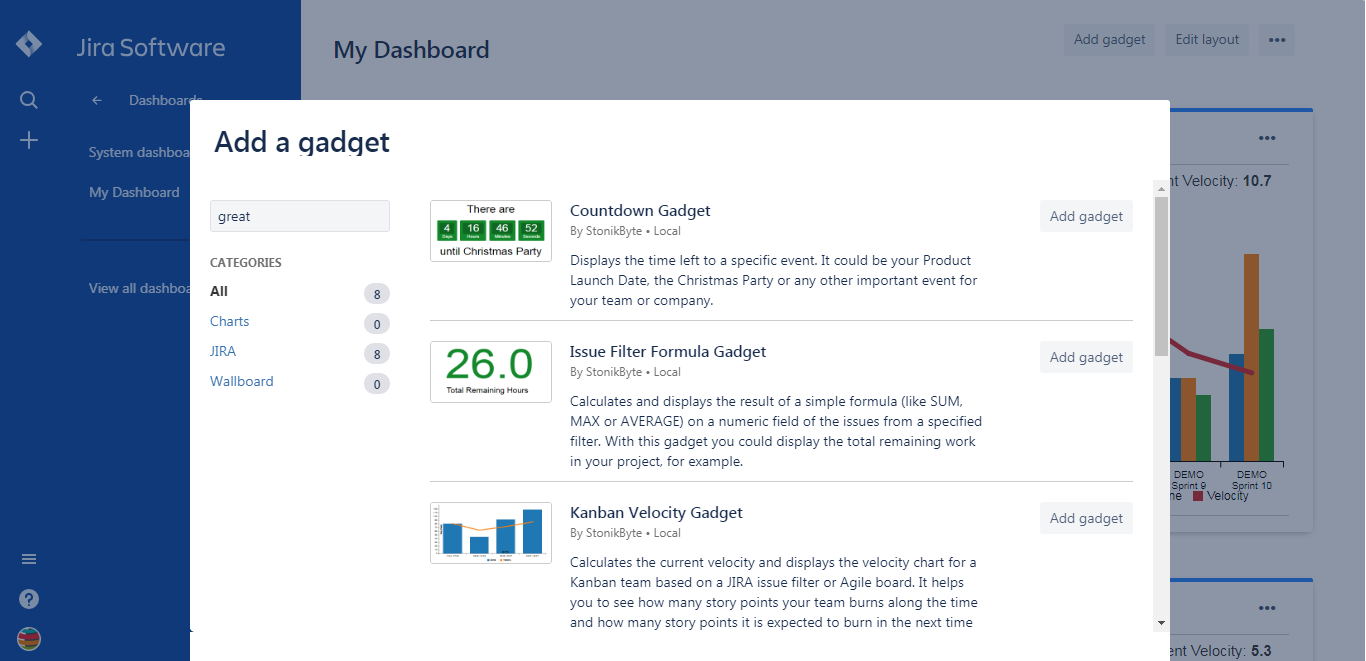
- Click the "Add gadget" button of the gadget that you want to add
- Once you added the gadgets, close the "Add a gadget" screen and continue by entering the gadget settings. See below the instructions for how to configure the gadgets.
Using the gadgets in Confluence Cloud
For using the gadgets in Confluence Cloud you have to install Great Gadgets for Confluence Cloud in your Confluence Cloud instance, no matter if you have or not Great Gadgets for Jira Cloud also installed in your Jira Cloud instance. Once installed, this app makes all the gadgets available as macros in your Confluence Cloud instance.
Most of the macros are based on the data taken from Jira. For these macros to work, you must have a Jira Cloud instance linked with the Confluence Cloud instance. In addition, the Jira Cloud instance must have either Great Gadgets for Jira Cloud or StonikByte Connector for Jira Cloud app installed.
To insert a macro into a Confluence page:
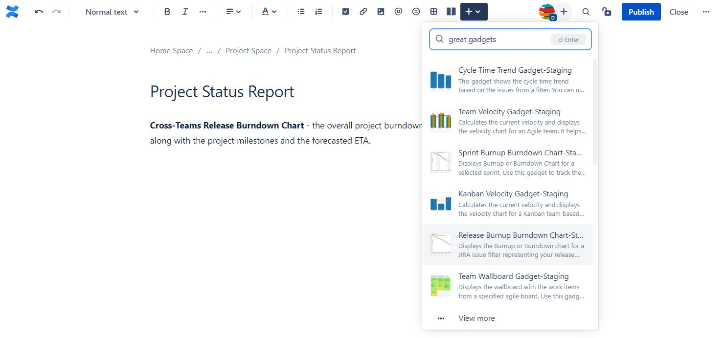
- Start editing the page where the macro will be inserted
- Click the "Insert" icon from the top menu bar and start searching for the macro that you want to insert. Search by "great gadgets" or "StonikByte" to display all the macros of the app.
- Continue by entering the macro settings. See below the instructions for how to configure the gadgets.
- When done, click the Save button from the macro's settings screen. The macro will be displayed on the Confluence page.
To edit an existing macro from a Confluence page:
- Start editing the page that contains the macro
- Hover the mouse pointer over the macro and click the Edit icon
- Edit the macro settings. See below the instructions for how to configure the gadgets.
- When done, click the Save button from the macro's settings screen. The macro will be displayed on the Confluence page according to the new settings.
Using the gadgets in Confluence Server or Data Center
If you have Jira Server or Data Center with Great Gadgets for Jira Server installed, you can also use the gadgets in Confluence Server or Data Center.
All you have to do is to import the gadgets from Jira as macros in Confluence. Follow the Atlassian documentation on how to make the gadgets available in Confluence: https://confluence.atlassian.com/doc/registering-external-gadgets-204050482.html
IMPORTANT There is a known issue that prevents this feature to work in environments that are configured to use Single Sign On (SSO). The solution is to apply the workaround described here: https://bitbucket.org/StonikByte/great-gadgets-add-on/issues/158/app-gadgets-not-working-on-confluence-data.
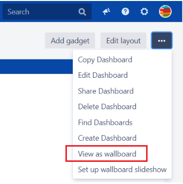
Using the gadgets in wallboard mode
In Jira (Cloud, Server or Data Center), you can display the gadgets in wallboard mode to make them visible on big TV screens as information radiators, for example.
To trigger the wallboard mode, click the View as wallboard option of the Jira dashboard's menu.
Gadgets Description
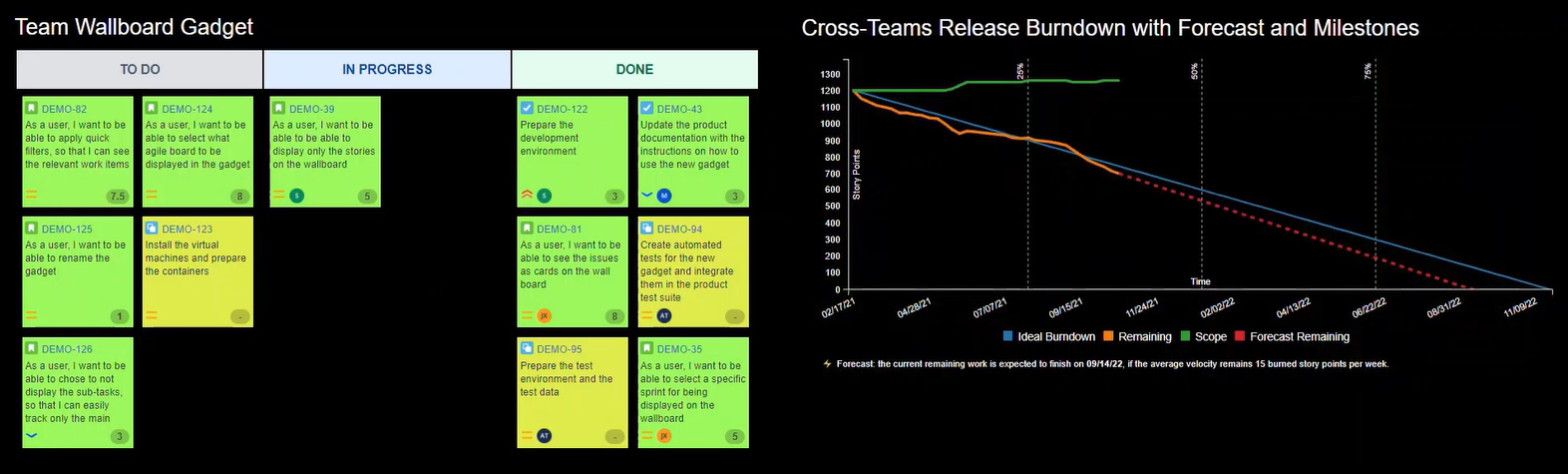
Team Wallboard Gadget
Displays the wallboard with the work items from a specified agile board. Supports both Scrum and Kanban board types, for team-managed ("next-gen") and company-managed projects. Use this gadget to see what your team is working on.
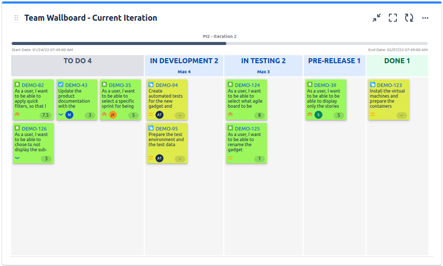
The gadget displays the parent tasks (Story, Task, etc) along with their key, summary, assignee, priority and estimate. It can also display the sub-tasks. The displayed estimate is configurable and it can be Story Points, Original Time Estimate or any numerical custom field. Optionally, you can apply one or more of the quick filters of the selected board.
See the settings description below for how to configure the gadget.

| Setting | Description |
|---|---|
| Gadget title | Choose what to display in the title bar of the gadget. |
| Board | Select the agile board to be displayed. The gadget displays only the issues from the selected board that are visible to the current Jira user. |
| Sprint | Choose what sprint to display on the wallboard. If Active sprint(s) is selected, the gadget will display the issues of the active sprint; if the board has multiple active sprints, all the issues from these sprints are displayed. This option applies only to the Scrum boards. |
| Quick filter | Choose to apply one or more quick filters of the selected board, for limiting the items displayed. This option is only available for the Cloud version. |
| Estimation field | Choose the field that contains the issue estimate or "None" if you don't want the estimate to be displayed. |
| Show sub-tasks | Check this if you want the sub-tasks to be also displayed on the wallboard. |
| Show sprint info | Check this if you want to display the sprint name along with the sprint timeline. |
| Use compact-size cards | Check this if you want to display the cards with a smaller size. |
| Swimlanes | Choose if the gadget should display swimlanes or not. A swimlane is a horizontal categorization of issues on the board. You can use swimlanes to help you distinguish tasks of different assignees, epics, priorities, etc. This option is only available for the Cloud version. |
| Cards color | Optionally, customize the color of the cards. You can choose a color for each issue hierarchy level (Epics > Stories, tasks, bugs > Sub-Tasks). |
| Refresh interval | Choose how often the gadget will refresh automatically. |
Related blog articles
- 7 gadgets for a powerful Scrum dashboard in Jira
- 11 “must-have” gadgets for any Kanban dashboard in Jira
- How to track multi-team or scaled-agile projects (such as SAFe®) in Jira with Great Gadgets app
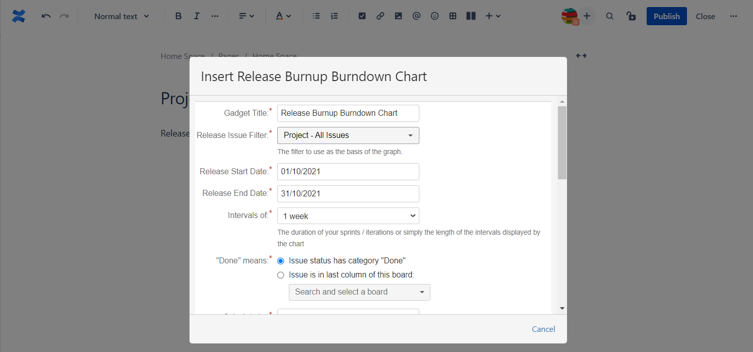
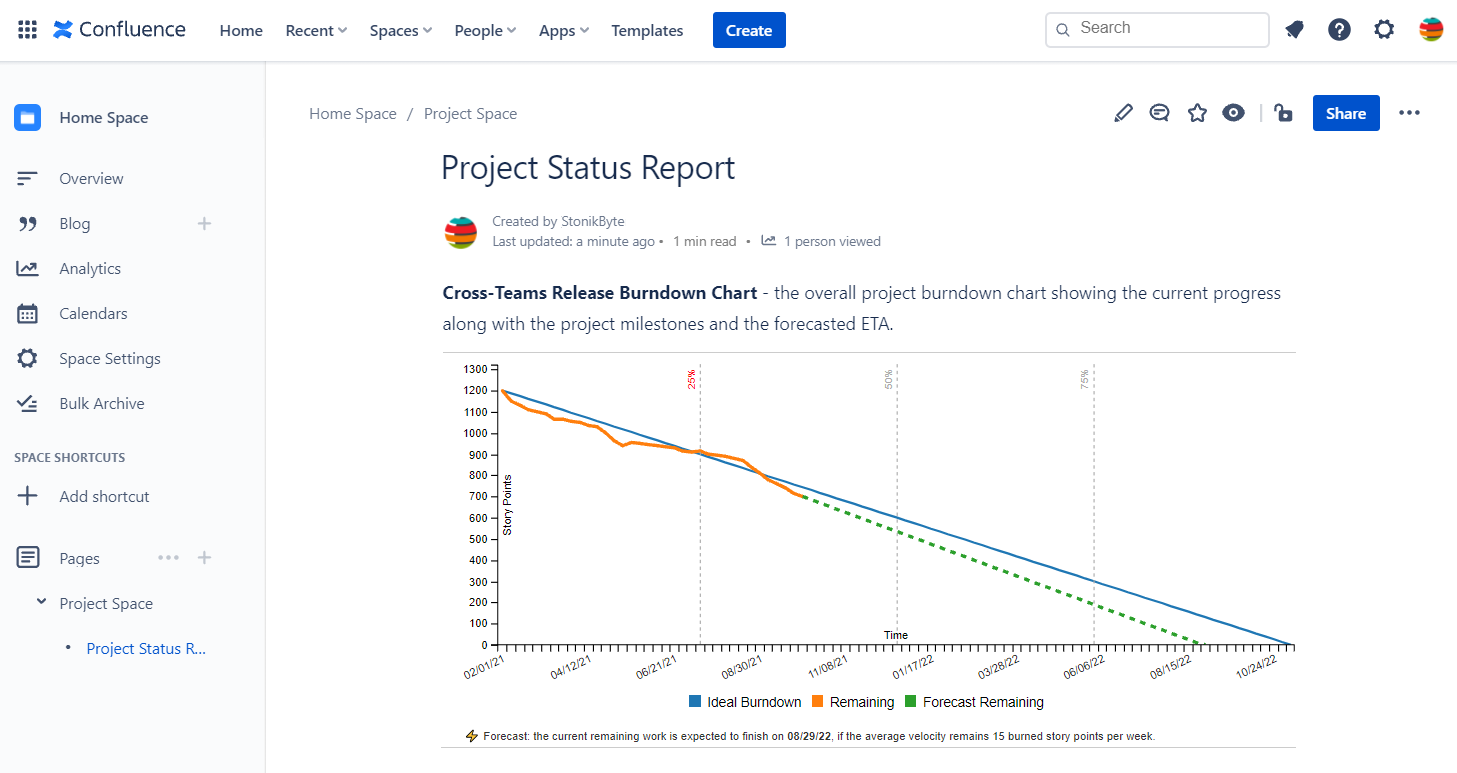
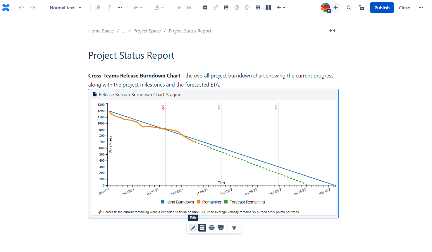
Release Burnup Burndown Chart
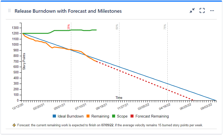
Displays the burnup and/or burndown chart for a project release represented by a Jira issue filter. The calculation can be done by Story Points, Original Time Estimate, Issue Count or by any numerical custom field and is based on historical data of every issue from the specified filter. You can also choose to include the sub-tasks in the calculation. The series to be displayed are configurable, thus allowing you to use the gadget as burndown, burnup or both. Use this gadget to track the progress of your project release in an agile manner.
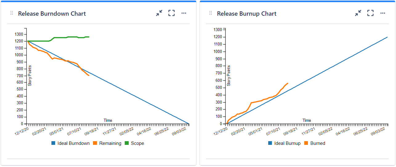
This gadget can also make a forecast (prediction) about when the release will be finished. How the forecast is made? First, the gadget determines the current velocity of your team based on the work done in the previous completed time intervals (Yesterday’s Weather). Then, it determines how many days are necessary to finish the current remaining work assuming that your velocity remains the same and it draws the dashed line accordingly to the determined release end-date.
Optionally, you can choose to display the milestones of the release, like for example at 25%, 50%, 75% of the release timeframe. A past milestone will be displayed in red color, if the Remaining work at that time was higher than Ideal Burndown, or in green color if it was lower, thus indicating if the milestone was reached or not.
See the settings description below for how to configure the gadget.
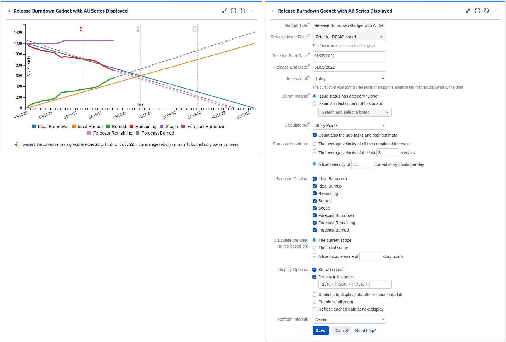
| Setting | Description |
|---|---|
| Gadget Title | Choose what to display in the title bar of the gadget. |
| Release Issue Filter | The Jira filter that contains the issues in your release (the scope of your project release). Make sure that the specified filter is shared if you want the other people to visualize the dashboard. |
| Release Start Date | The start date of your release. |
| Release End Date | The end date of your release. |
| Intervals of | Indicates the time interval for calculating the chart data. If you do Agile development, this should be set according to the length of your sprints or iterations. |
| "Done" means | Specify how to consider the issue as being "done". If you do Agile development, you should select the Agile board of your team. |
| Calculate by | Specify on which criteria the calculation to be performed. You can choose between: * Story Points - the default value, use this option if the issues are estimated in Story Points. If the issues are from team-managed projects (aka next-gen projects), select Story Point Estimate instead. * Original Time Estimate - use this if you use time estimates; calculation will be done in hours. The Scope will be calculated as the sum of the Original Estimate field of all the issues from the filter and each time an issue is marked as done the Burned and Remaining lines will increase/decrease with the amount of hours that is set at Original Estimate for that issue. This option does not consider the time spent (work logged). * Time Remaining & Time Spent - use this option if you use time estimates and your team logs the worked time on a daily basis; calculation will be done in hours. The Scope will be calculated as the sum of the Time Spent and Time Remaining of all the issues from the filter. Burned is calculated as the sum of Time Spent of all the issues from the filter, plus the sum of Time Remaining of all the issues from the filter that are done. Remaining is calculated as Scope minus Burned. This option does not consider the Original Estimate field. * Issue Count - use this if you want the calculation to be done by the number of issues. * Other numerical custom field defined in your Jira instance - pickup the numerical custom field that you use to track or to estimate the issues. |
| Count also the sub-tasks and their estimate | Check this option if you want the gadget to consider the sub-tasks from the filter and their estimate when doing the calculation. |
| Forecast made by: | Specifies how the forecast about release end-date is made. It takes effect over the Forecast Burndown and Forecast Remaining series in case you choose to display any of them. You can choose between: The average velocity of all the completed intervals - the forecast will be made based on the average velocity of all the previous completed intervals The average velocity of the last ? intervals - the forecast will be made based on the average velocity of the last completed intervals, as specified A fixed velocity of... - the forecast will be made based on the fixed velocity that you introduce manually |
| Series to Display | Choose what series to display in the chart. You can select one or more options: Ideal Burndown - the ideal line specific to a burndown chart. It indicates how the remaining work should evolve in the ideal case. It is calculated based on Scope (see bellow). Ideal Burnup - the ideal line specific to a burnup chart. It shows how the done (burned) work should evolve in the ideal case. It is calculated based on Scope (see bellow). Remaining - the total amount of remaining work at that time; it is specific to burndown chart Burned - the total amount of work done at that time; it is specific to burnup chart Scope - represents the current release goal - the total amount of work to be done in the release at that time. Select this if you want to see the changes in the release scope along the time. Forecast Burndown - makes a forecast (prediction) about when the remaining work is finished and displays it as dashed line between the start of the release and the estimated release end-date. Forecast Remaining - makes a forecast (prediction) about when the remaining work is finished and displays it as dashed line between the end of the Remaining line and the estimated release end-date. Forecast Burned - makes a forecast (prediction) about when the remaining work is finished and displays it as dashed line between the end of the Burned line and the estimated release end-date. Tips To configure the gadget as a "classic" burndown chart, select only the Ideal Burndown and Remaining series. To configure the gadget as a "classic" burnup chart, select only the Ideal Burnup and Burned series. |
| Calculate the ideal series based on | Choose how the ideal series will be calculated. The current scope means that the Ideal Burndown line starts from a value that is the same as the current (latest) value of the Scope series, while The initial scope means that the Ideal Burndown line starts from a value that is the same as the value of the Scope series at the start of the release. You can also choose A fix scope value of and specify a number representing the total work estimate of the release. This third option is useful when you have a rough estimate of the total work, but you did not add yet all the corresponding issues or estimates in Jira. |
| Show legend | Check this if you want the chart legend to be displayed. |
| Display milestones | Check this option and enter the values (percents of the planned release duration) corresponding to the milestones to be displayed. A past milestone will be displayed in red color, if the Remaining work at that time was higher than Ideal Burndown, or in green color if it was lower, thus indicating if the milestone was reached or not. The future milestones are displayed in gray color. |
| Continue to display data after release end date | Check this option if you want the chart to still display data even if the release date passed. When this option is checked, the chart lines Scope, Remaining, Burned and forecast will continue after release end-date. |
| Enable scroll zoom | Check this if you want to be able to zoom-in while scrolling with the mouse wheel over the chart. |
| Refresh cached data at next display | This gadget uses data caching for faster display, which means that some data resulted after processing are saved and reused next time when the gadget is loaded. If you check it, the cache of the gadget will be deleted and recreated at the next reloading. This setting is not persistent. |
Related blog articles
- Cross-project release burndown chart in Jira with Great Gadgets app
- A powerful Reported vs Done chart for Jira dashboards
- 7 gadgets for a powerful Scrum dashboard in Jira
- Tracking an agile project that uses time estimates with Great Gadgets for Jira
- How to track multi-team or scaled-agile projects (such as SAFe®) in Jira with Great Gadgets app
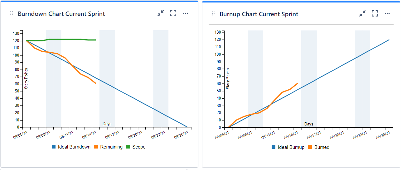
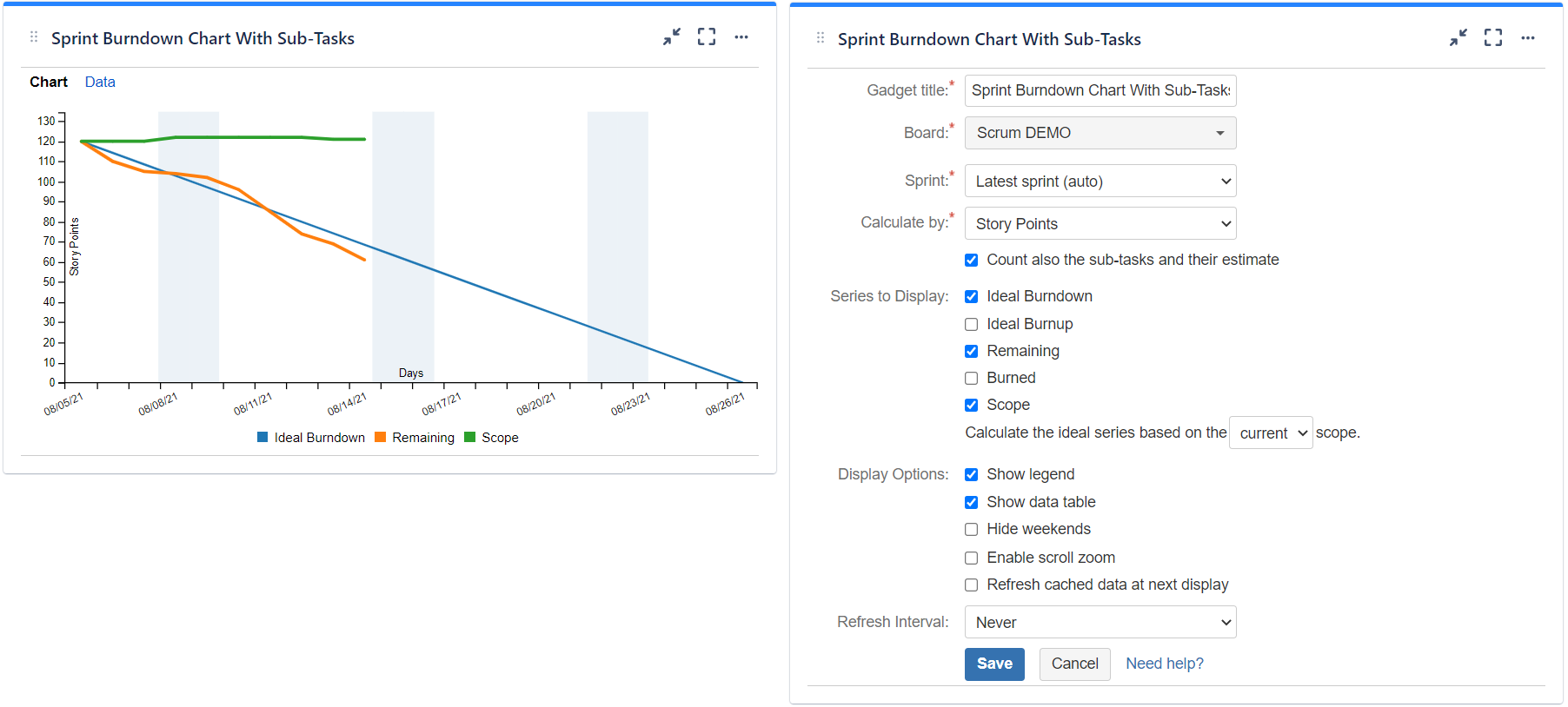
Sprint Burnup Burndown Chart
Displays the burnup and/or burndown chart for a specified sprint. The calculation can be done by Story Points, Original Time Estimate, Time Remaining & Time Spent, Issue Count or by any numerical custom field and it is based on historical data of every issue in the sprint. You can also choose to include the sub-tasks in the calculation. The series to be displayed are configurable, thus allowing you to use the gadget as burndown, burnup or both. Use this gadget to track the progress of your Agile team during the sprint.
See the settings description below for how to configure the gadget.
| Setting | Description |
|---|---|
| Gadget Title | Choose what to display in the title bar of the gadget. |
| Board | Choose the Scrum board that contains your Agile sprint. |
| Sprint | Choose the sprint for which to display the data. If you select Latest sprint (auto) the most recent sprint that is either closed or active will be used. Use this option if you want not to set the sprint manually all the time. |
| Calculate by | Specify on which criteria the calculation to be performed. You can choose between: * Story Points - the default value, use this option if the issues are estimated in Story Points. If the issues are from team-managed projects (aka next-gen projects), select Story Point Estimate instead. * Original Time Estimate - use this if you use time estimates; calculation will be done in hours. The Scope will be calculated as the sum of the Original Estimate field of all the issues from the sprint and each time an issue is marked as done the Burned and Remaining lines will increase/decrease with the amount of hours that is set at Original Estimate for that issue. This option does not consider the time spent (work logged). * Remaining Time Estimate - select this option if you want to track by Remaining Estimate; calculation will be done in hours. When this option is selected, the chart displays only the Remaining and Ideal Burndown lines. The Remaining is calculated as the sum of Remaining Estimate field of all the issues from the sprint, regardless their status. This option does not consider the time spent (work logged). * Time Remaining & Time Spent - use this option if you use time estimates and your team logs the worked time on a daily basis; calculation will be done in hours. The Scope will be calculated as the sum of the Time Spent and Time Remaining of all the issues from the sprint. Burned is calculated as the sum of Time Spent of all the issues from the sprint, plus the sum of Time Remaining of all the issues from the sprint that are done. Remaining is calculated as Scope minus Burned. This option does not consider the Original Estimate field. * Issue Count - use this if you want the calculation to be done by number of issues * Other numerical custom field defined in your Jira instance - pickup the numerical custom field that you use to track or to estimate the issues. |
| Count also the sub-tasks and their estimate | Check this option if you want the gadget to consider the sub-tasks from the filter and their estimate when doing the calculation. |
| Series to Display | Choose what series to display in the chart. You can select one or more options: Ideal Burndown - the ideal line specific to a burndown chart. It indicates how the remaining work should evolve during the sprint in the ideal case. It is calculated based on Scope (see bellow). Ideal Burnup - the ideal line specific to a burnup chart. It shows how the done (burned) work should evolve during the sprint in the ideal case. It is calculated based on Scope (see bellow). This option is not available if "Calculate by" is set to "Remaining Time Estimate". Remaining - the total amount of remaining work at that time; it is specific to burndown chart Burned - the total amount of work done at that time; it is specific to burnup chart. This option is not available if "Calculate by" is set to "Remaining Time Estimate". Scope - represents the current sprint goal - the total amount of work to be done in the sprint. Select this if you want to see the changes in the sprint scope along the time. This option is not available if "Calculate by" is set to "Remaining Time Estimate". Tips To configure the gadget as a "classic" burndown chart, select only the Ideal Burndown and Remaining series. To configure the gadget as a "classic" burnup chart, select only the Ideal Burnup and Burned series. Choose also how the ideal series will be calculated. By initial scope means that the first value of the Ideal Burndown line is the value of the Scope series at the start of the sprint while by current scope means that the first value of the Ideal Burndown line is the current (latest) value of the Scope series. This setting applies also to the Ideal Burnup line. |
| Show legend | Check this if you want the chart legend to be displayed. |
| Tilted labels for x-axis (avoid overlapping) | Check this to avoid overlapping of the x-axis labels. |
| Show data table | Check this option if you want a data table to be displayed along with the chart. The Data tab displays a sprint report based on the current status, which includes the list of completed and not completed issues. 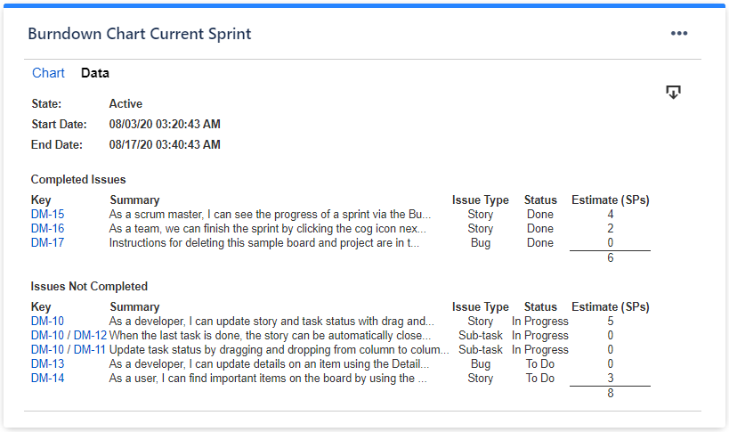 |
| Refresh cached data at next display | This gadget uses data caching for faster display, which means that some data resulted after processing are saved and reused next time when the gadget is loaded. If you check it, the cache of the gadget will be deleted and recreated at the next reloading. This setting is not persistent. |
Related blog articles
- 7 gadgets for a powerful Scrum dashboard in Jira
- Tracking an agile project that uses time estimates with Great Gadgets for Jira
- How to track multi-team or scaled-agile projects (such as SAFe®) in Jira with Great Gadgets app
Team Velocity Gadget
Calculates and displays the average velocity of the Agile team along with the history of previous sprints. The calculation can be done by Story Points, Original Time Estimate, Time Remaining & Time Spent, Issue Count or by any numerical custom field and it is based on historical data of every issue. You can also choose to include the sub-tasks in the calculation. The team's velocity is an essential metric that helps the Agile teams not to over-commit, but also helps them to see how they perform from a sprint to another.
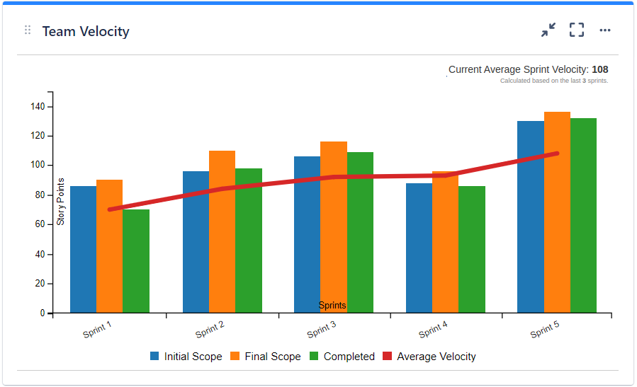
Initial Scope - Indicates the scope at the start of the sprint (the team commitment).
Final Scope - Indicates the scope at the end of the sprint, after the eventual scope changes. This helps you to determine if your team tends to change the sprint scope and how much.
Completed - The total amount of work done in that sprint.
Average Velocity - The (rolling) average velocity calculated as the average of the work done in the last sprints, according to the gadget's settings.
Optionally, additional series can be displayed in the chart:
Scope change - represents the scope change of the sprint, calculated as the difference between Final Scope and Initial Scope.
Scope change absolute - represents the scope change of the sprint as absolute value, calculated as the sum of Added and Removed.
Added - indicates the amount of work added to the scope after the sprint was started.
Removed - indicates the amount of work removed from the initial scope after the sprint was started.
% Scope Change - indicates the percent of scope change relative to the Initial Scope.
% Scope Change Absolute - indicates the percent of scope change absolute relative to the Initial Scope.
% Added - indicates the percent of work added relative to the Initial Scope.
% Removed - indicates the percent of work removed relative to the Initial Scope.
% Completed - indicates the percent of work completed relative to the Initial or Final scope, at your choice.
See the settings description below for how to configure the gadget.
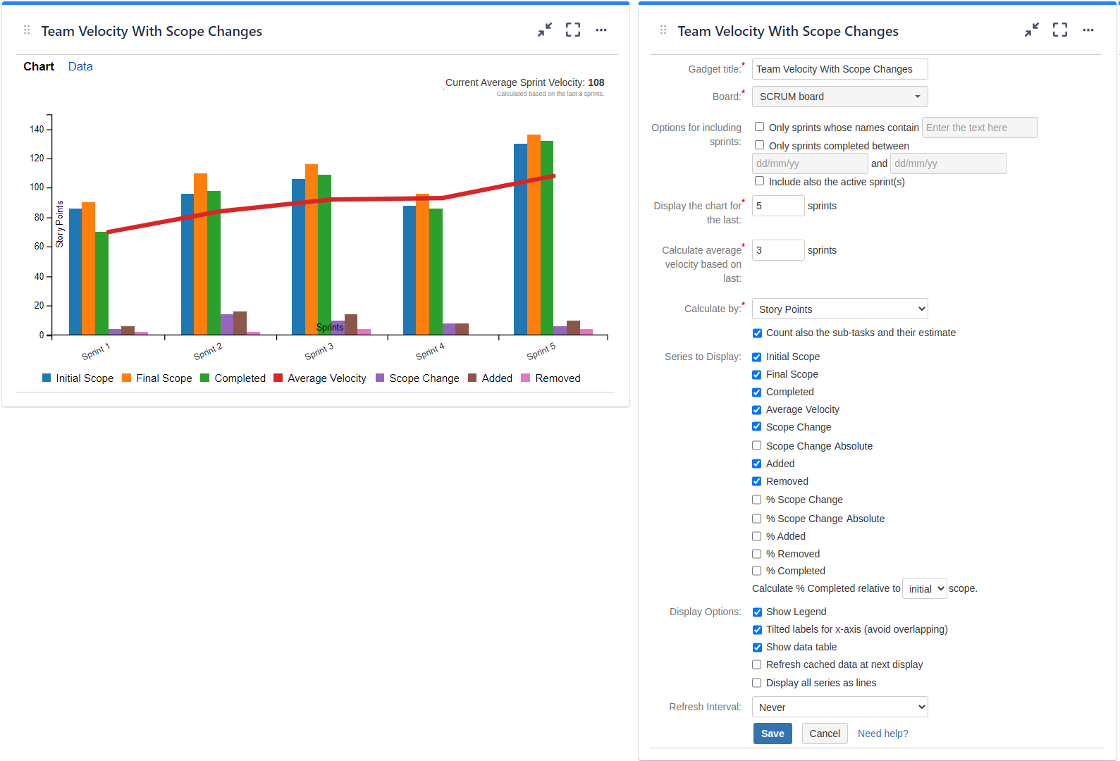
| Setting | Description |
|---|---|
| Gadget Title | Choose what to display in the title bar of the gadget. |
| Board | Choose the Scrum board of your team. |
| Options for including sprints | The gadget displays the closed sprints, but you can choose to include only certain sprints or to include also the active sprints. Check Only sprints whose names contain... and enter the text to match if you want only specific sprints to be displayed by the chart. This option is useful when you want to filter out some of the sprints of the board. Also, you can check Only sprints completed between... and enter the dates of the time interval if you want to display only the sprints that were completed (closed) in that time interval. This option is useful when you want to see the velocity for sprints in the past. For example, the sprints from the previous year. Check Include also the active sprint(s) if you want to display also the active sprints (if any) along with the closed sprints. |
| Display the chart for the last ? sprints | Specify the number of previous sprints to be displayed in the chart, starting from the most recent. |
| Calculate average velocity based on last ? sprints | Specify the number of previous sprints to be used when calculating the average velocity. Velocity is calculated as the average of the total SPs done in each of these sprints. |
| Calculate by | Specify on which criteria the calculation to be performed. You can choose between: * Story Points - the default value, use this if the issues are estimated in Story Points. If the issues are from team-managed projects (aka next-gen projects), select Story Point Estimate instead. * Original Time Estimate - use this if you use time estimates; calculation will be done in hours. * Time Remaining & Time Spent - use this option if you use time estimates and your team logs the worked time on a daily basis; calculation will be done in hours. The Initial Scope will be calculated as the sum of the Time Spent and Time Remaining of all the issues at the time when the sprint was started. The Final Scope will be calculated as the sum of the Time Spent and Time Remaining of all the issues at the end of the sprint. Completed is calculated as the sum of Time Spent of all the issues from the sprint, plus the sum of Time Remaining of all the issues from the sprint that were done. If you check Ignore the time logged before the start of the sprint, the calculation will be based only on the work logged during the sprint as it follows: The Initial Scope will be calculated as the sum of Time Remaining of all the issues at the time when the sprint was started. The Final Scope will be calculated as the sum of the Time Spent during the sprint and Time Remaining of all the issues at the end of the sprint. Completed is calculated as the sum of Time Spent during sprint of all the issues from the sprint. NOTE The Ignore the time logged before the start of the sprint option is available only if Calculate by is set to Time Remaining & Time Spent. * Issue Count - use this if you want the calculation to be done by number of issues * Other numerical custom field defined in your Jira instance - pickup the numerical custom field that you use to track or to estimate the issues. |
| Series to Display | Choose what series to display in the chart. You can select one or more options: Initial Scope - represents the scope at the start of the sprint (the team commitment). Final Scope - represents the scope at the end of the sprint, after the eventual scope changes. This helps you to determine if your team tends to change the sprint scope and how much. Completed - represents the total amount of work done in that sprint. Average Velocity - The average velocity calculated as the average of the work done in the last sprints, according to the gadget settings. Scope change - represents the scope change of the sprint, calculated as the difference between Final Scope and Initial Scope. Scope change absolute - represents the scope change of the sprint as absolute value, calculated as the sum of Added and Removed. Added - indicates the amount of work added to the scope after the sprint was started. Removed - indicates the amount of work removed from the scope after the sprint was started. % Scope Change - indicates the percent of scope change relative to the Initial Scope. % Scope Change Absolute - indicates the percent of scope change absolute relative to the Initial Scope. % Added - indicates the percent of work added relative to the Initial Scope. % Removed - indicates the percent of work removed relative to the Initial Scope. % Completed - indicates the percent of work completed relative to the Initial or Final scope, depending on what you selected at Calculate %Completed relative to ? scope. |
| Count also the sub-tasks and their estimate | Check this option if you want the gadget to consider the sub-tasks from the filter and their estimate when doing the calculation. |
| Show legend | Check this if you want the chart legend to be displayed. |
| Tilted labels for x-axis (avoid overlapping) | Check this to avoid overlapping of the x-axis labels. |
| Show data table | Check this option if you want a data table to be displayed along with the chart. The Data tab displays all the sprints along with the issues that affected their velocity. The issues that had zeros on all the columns are not displayed. 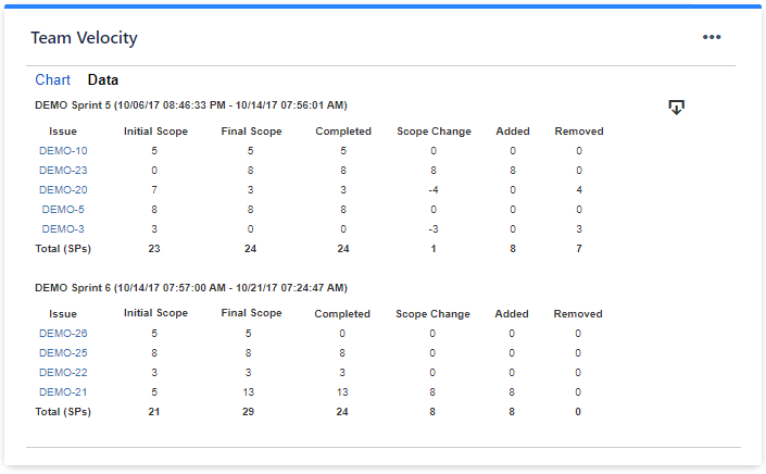 |
| Display all series as lines | Check this option if you want the chart to have all the series displayed as lines (instead of bars). |
| Refresh cached data at next display | This gadget uses data caching for faster display, which means that some data resulted after processing are saved and reused next time when the gadget is loaded. If you check it, the cache of the gadget will be deleted and recreated at the next reloading. This setting is not persistent. |
Related blog articles
- 7 gadgets for a powerful Scrum dashboard in Jira
- How to track multi-team or scaled-agile projects (such as SAFe®) in Jira with Great Gadgets app
Cumulative Flow Diagram Gadget
Displays the cumulative flow diagram (CFD) for the issues in an agile board or filter. It is a stacked area chart that shows the number of tasks in each column of the board or in each status category along the time. When you view the data for a particular day, you will know how many work items were present in each column at the end of that day. You can choose to display the chart by Issue Count, Story Points, Original Time Estimate or by any other numerical custom field.
The cumulative flow diagram is one of the most advanced analytics in Agile project management. Use this gadget to determine how stable your flow is and to understand where you need to focus on making your process more predictable. It gives you quantitative and qualitative insight into past and existing problems.
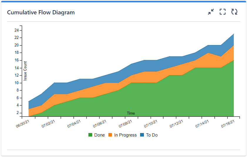
Depending on how it was configured, the chart displays multiple series (or "bands"):
Done - The total number of done issues. Depending on the gadget settings, "done" means all the issues with status category "done" (the green-colored statuses from Jira) or the issues in the last column of the selected board.
In Progress - The total number of "In progress" issues. Depending on the gadget settings, "in progress" means all the issues with status category "in progress" (the blue-colored statuses from Jira) or the issues in the middle column(s) of the selected board.
To Do - The total number of issues in "to do". Depending on the gadget settings, "To Do" means all the issues with status category "To Do" (the gray-colored statuses from Jira) or the issues in the first column of the selected board.
Also, if so configured, the gadget can display bands that correspond to the columns of a selected agile board. In this case, the series names will be the same as the column names.
See the settings description below for how to configure the gadget.
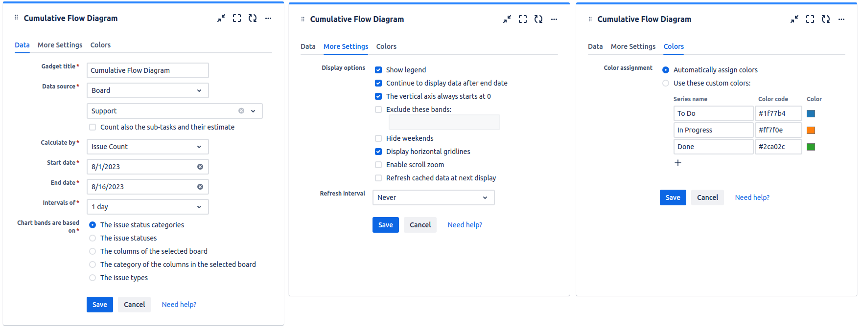
| Setting | Description |
|---|---|
| Gadget Title | Choose what to display in the title bar of the gadget. |
| Data | Choose the agile board of your team or specify a Jira issue filter containing the issues that you want to track. Make sure that the specified filter is shared with the users who will also visualize this gadget. |
| Calculate by | Specify on which criteria the calculation to be performed. You can choose between: * Issue Count - the default value, use this if you want the chart to be made by number of issues * Story Points - use this if you want the chart to be made by summing-up the Story Points of the issues in each band. If the issues are from team-managed projects (aka next-gen projects), select Story Point Estimate instead. * Original Time Estimate - use this if you want the chart to be made by summing-up the Original Time Estimate of the issues in each band; the values will be displayed in hours * Other numerical custom field defined in your Jira instance. |
| Include the sub-tasks | Check this option if you want the sub-tasks from the selected board or filter to be included in the calculation. |
| Start Date | Specify the start-date of the time interval for which to display data. |
| End Date | Specify the end-date of the time interval for which to display data. |
| Intervals of | Indicates the length of the intervals displayed on the horizontal axis. |
| Chart bands are based on | Specify on which criteria the bands displayed in the chart are determined. You can choose between: The issue status category - the default value. When using this option, the chart displays 3 bands: * Done - counts all the issues with status category "done" (the green-colored statuses from Jira) * In progress - counts all the issues with status category "in progress" (the blue-colored statuses from Jira) * New - counts all the issues with status category "new" (the gray-colored statuses from Jira) The columns of the selected board - when using this option, each column of the board has a corresponding band in the chart, displaying the number of issues in that column. The issue statuses - when using this option, each workflow status that is mapped on the columns of the selected board has a corresponding band in the chart. If a filter is selected, the chart displays a band for each of the workflow statuses reached by the issues from the filter. The category of the columns in the selected board - When using this option, the chart displays 3 bands: * Done - counts all the issues in the last column of the selected board. * In progress - counts all the issues in the middle column(s) of the selected board. * New - counts all the issues in the first column of the selected board. |
| Show legend | Check this if you want the chart legend to be displayed. |
| Enable scroll zoom | Check this if you want to be able to zoom-in while scrolling with the mouse wheel over the chart. |
| Continue to display data after end date | Check this option if you want the chart to still display data even if the end date passed. |
| Refresh cached data at next display | This gadget uses data caching for faster display, which means that some data resulted after processing are saved and reused next time when the gadget is loaded. If you check it, the cache of the gadget will be deleted and recreated at the next reloading. This setting is not persistent. |
Related blog articles
- 11 “must-have” gadgets for any Kanban dashboard in Jira
- How to track multi-team or scaled-agile projects (such as SAFe®) in Jira with Great Gadgets app
Kanban Velocity Gadget
Calculates and displays the current average velocity / throughput of the Agile team that is using Kanban based on a Jira issue filter or an Agile board. The calculation can be done by Story Points, Original Time Estimate, Issue Count or by any numerical custom field and it is based on historical data of every issue. You can also choose to include the sub-tasks in the calculation.
Use this gadget to see how much business value your team delivers along the time and how much work is expected to get done in the next period.
How it works? For each time interval displayed in the chart, it counts the issues that were done in that time interval and it sums-up the estimate that each issue had at the end of that time interval. Please note that this gadget does not consider the issues reopened or re-estimated from an interval to another, so the calculated velocity might differ in comparison with the one displayed by the other gadgets like, for instance, the Release Burnup Burndown Chart gadget.
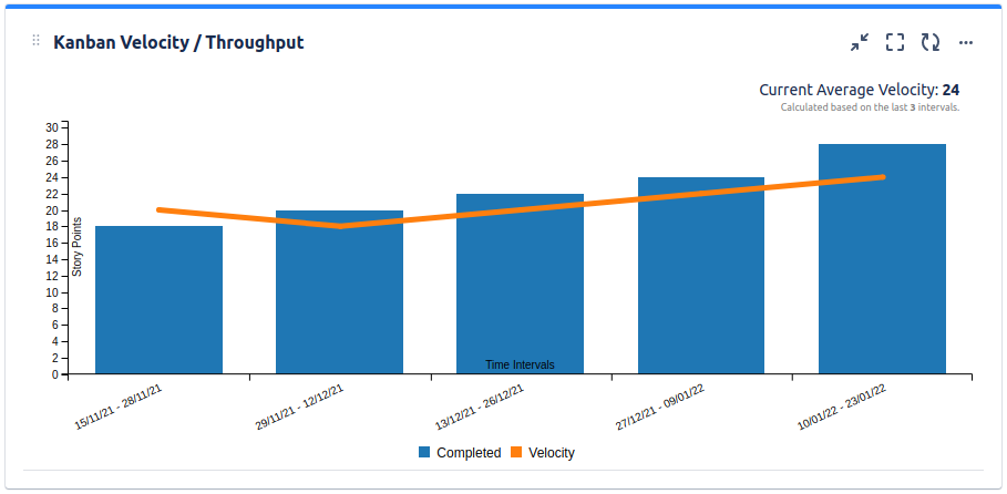
Done - The total amount of work done in that time interval, calculated in story points, hours or number of issues according to the gadget's settings.
Velocity - The (rolling) average velocity / throughput calculated as the average of done work on the last time intervals, according to the gadget's settings.
See the settings description below for how to configure the gadget.
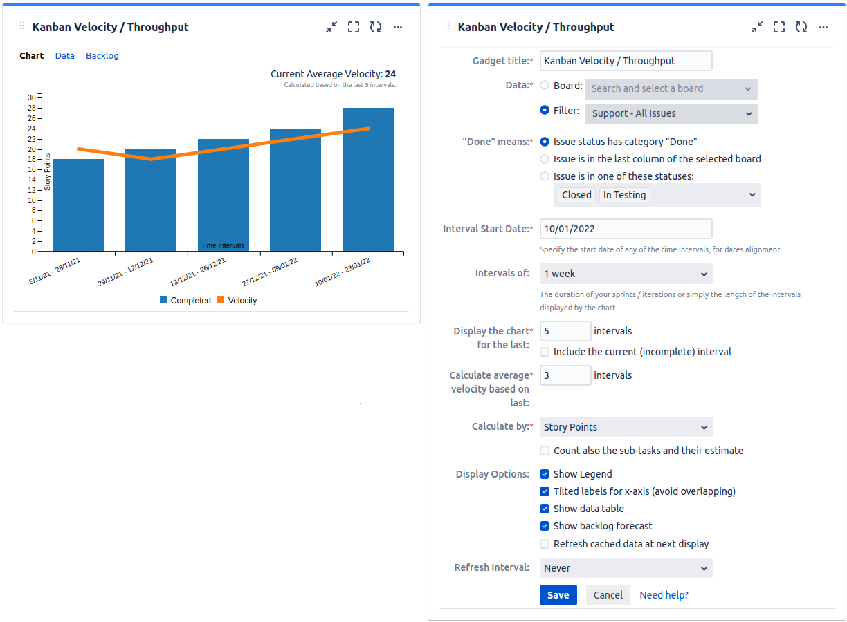
| Setting | Description |
|---|---|
| Gadget Title | Choose what to display in the title bar of the gadget. |
| Data | Choose the board of your team or specify a Jira issue filter representing the scope of your project. Make sure that the specified filter is shared with the users who will also visualize this gadget. |
| "Done" means | Specify how to consider the issue as being "done". "Issue status has category Done" will consider as "done" all the issues with status category "done" (the green-colored statuses from Jira, like Closed, Resolved or Done). If you selected an Agile dashboard at Data, you should choose "Issue is in the last column of the selected board". If you want to be considered as "done" the issues that are in specific statuses, choose "Issue is in one of these statuses" and then select the statuses. |
| Interval Start Date | Specify a date when one (any) of the time intervals starts. This is only used by the gadget to determine when the time intervals should start (dates alignment). |
| Intervals of | Specify the duration (in weeks) for the time intervals used when calculating and displaying the velocity. If you do Agile development, this should be set according to the length of your sprints or iterations. |
| Display the chart for the last ? intervals | Specify the number of previous completed time intervals to be displayed in the chart, starting from the most recent. |
| Include the current (incomplete) interval | Check this if you want the interval of the current day to be displayed. Please keep in mind that the current interval is incomplete and the calculation of the current velocity is impacted accordingly. |
| Calculate average velocity based on last ? intervals | Specify the number of time intervals to be used when calculating the average velocity. Velocity is calculated as the average of the total SPs done in each of these intervals. |
| Calculate by | Specify on which criteria the calculation to be performed. You can choose between: * Story Points - the default value, use this if the issues are estimated in Story Points. If the issues are from team-managed projects (aka next-gen projects), select Story Point Estimate instead. * Original Time Estimate - use this if you use time estimates; calculation will be done in hours * Issue Count - use this if you want the calculation to be done by number of issues * Other numerical custom field defined in your Jira instance - pickup the numerical custom field that you use to track or to estimate the issues |
| Count also the sub-tasks and their estimate | Check this option if you want the gadget to consider the sub-tasks from the filter and their estimate when doing the calculation. |
| Show data table | Check this option if you want a data table to be displayed along with the chart. The Data tab displays all the time intervals with the issues that affected their velocity. The issues that had zeros on all the columns are not displayed. 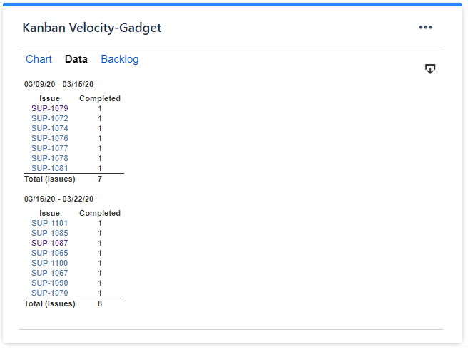 |
| Show backlog forecast | Check this option if you want the gadget to display a tab with the current backlog (unresolved issues from the selected filter or board) displayed along with their ETA determined automatically based on the current velocity. Before checking this option, ensure that your backlog is properly ranked, the most urgent issues being on top of the list. 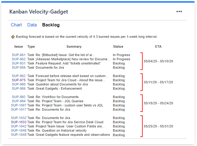 |
| Refresh cached data at next display | This gadget uses data caching for faster display, which means that some data resulted after processing are saved and reused next time when the gadget is loaded. If you check it, the cache of the gadget will be deleted and recreated at the next reloading. This setting is not persistent. |
Related blog articles
- How to track the team velocity in Kanban with Great Gadgets app for Jira
- 11 “must-have” gadgets for any Kanban dashboard in Jira
- How to track multi-team or scaled-agile projects (such as SAFe®) in Jira with Great Gadgets app
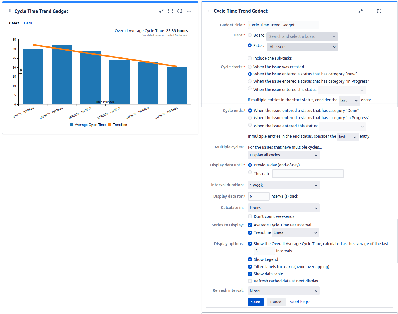
Cycle Time Trend Gadget
Depending on how you configure it, this gadget can calculate the key Kanban metrics like "Cycle Time" (aka ) or "Lead Time" and displays their trend. Or, you can simply calculate the time between two Jira statuses from the workflow. Use this gadget to see how fast your team delivers and to identify bottlenecks in your process flow.
- "Cycle Time" is the amount of time that the team spent working on an item without the time that the task spent waiting on the board. Therefore, the Cycle Time should start being measured, when the item task enters a "working" status, not earlier.
- "Lead Time" is the time from the moment when the request was made by a client and placed on a board to when all the work on it is completed and the request was delivered to the client. So it is the total time the client is waiting for an item to be delivered.
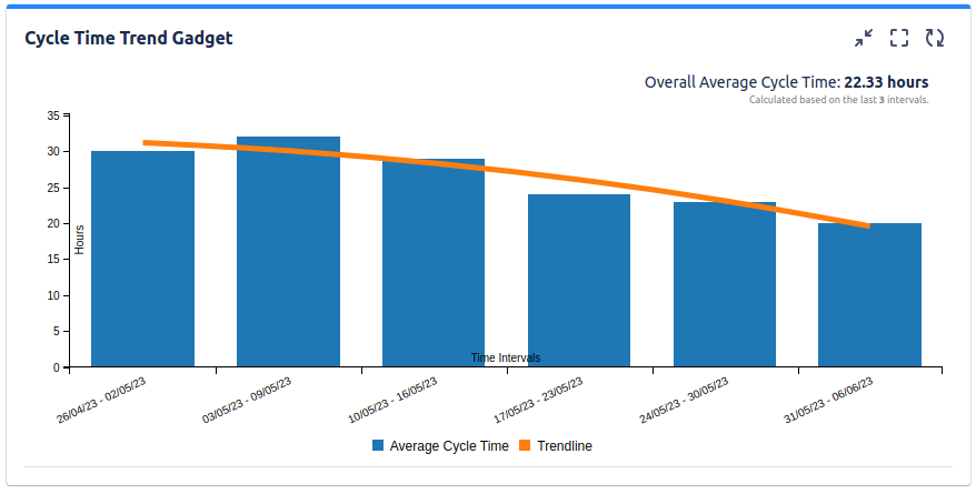
The data is displayed for a specified number of time intervals relative to a specified date. For each time interval the gadget identifies those issues from specified filter (or dashboard's filter) that had a cycle completed in that interval, determines the cycle(s) duration, calculates the average time for that interval and displays it in the trend chart.
See the settings description below for how to configure the gadget.
Tips
To calculate "Cycle Time", set the following:
* Cycle starts = When the issue entered a status that has category "In Progress"
* Cycle ends = When the issue entered a status that has category "Done"
To calculate "Lead Time", set the following:
* Cycle starts = When the issue was created OR When the issue entered a status that has category "New"
* Cycle ends = When the issue entered a status that has category "Done".
| Setting | Description |
|---|---|
| Gadget Title | Choose what to display in the title bar of the gadget. |
| Data | Choose the board or the Jira issue filter containing the issues for which you want the metrics to be calculated. Make sure that the specified filter is shared with the users who will also visualize this gadget. Check Include the sub-tasks if you want the sub-tasks from the selected board or filter to be included in the calculation. |
| Cycle starts | Indicates what to consider as the start event of a cycle. You can choose between: * When the issue was created * When the issue entered a status that has category "New" - the cycle starts when the issue was transitioned to any workflow status of category "New". This includes those grey-colored statuses from Jira, like New, Backlog or To Do. * When the issue entered a status that has category "In Progress" - the cycle starts when the issue was transitioned to any workflow status of category "In Progress". This includes those blue-colored statuses from Jira, like In Work, In Progress or In Testing. * When the issue entered this status - cycle starts when the issue was transitioned to the specified workflow status. Choose also how to handle the case when there are multiple transitions to the start status or to the status category by setting If multiple entries in the start status, consider the ? entry to first or last. See the example below. Example You configured the gadget to start the cycle When the issue entered a status that has category "In Progress" and to end the cycle When the issue entered a status that has category "Done" and there is a Jira issue that had multiple entries in the "In Progress" status before being moved to "Done". How the cycle time should be calculated, from the first or from the last transition in the "In Progress" status?  If you set If multiple entries in the start status, consider the first entry, the cycle will start when the issue was transitioned in the "In Progress" status for the first time.  If you set If multiple entries in the start status, consider the last entry, the cycle will start when the issue was transitioned in the "In Progress" status for the last time. 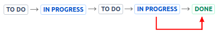 |
| Cycle ends | Indicates what to consider as the end event of a cycle. You can choose between: * When the issue entered a status that has category "Done" - the cycle ends when the issue was transitioned to any workflow status of category "Done". This includes those green-colored statuses from Jira, like Done, Resolved or Closed. * When the issue entered a status that has category "In Progress" - the cycle ends when the issue was transitioned to any workflow status of category "In Progress". This includes those blue-colored statuses from Jira, like In Work, In Progress or In Testing. * When the issue entered this status - the cycle ends when the issue was transitioned to the specified workflow status. Choose also how to handle the case when there are multiple transitions to the end status, by setting If multiple entries in the end status, consider the ? entry to first or last. See the example below. Example You configured the gadget to start the cycle When the issue entered a status that has category "New" and to end the cycle When the issue entered a status that has category "Done" and there is a Jira issue that had multiple entries in the "Done". How the cycle time should be calculated, till the first or till the last transition in the "Done" status?  If you set If multiple entries in the end status, consider the first entry, the cycle will end when the issue was transitioned in the "Done" status for the first time. 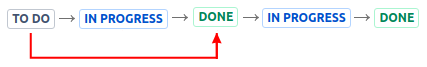 If you set If multiple entries in the end status, consider the last entry, the cycle will end when the issue was transitioned in the "Done" status for the last time. 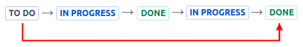 |
| Multiple cycles | Decide how the gadget should handle those Jira issues that have multiple cycles. This situation occurs if the issue was transitioned multiple times through the start and the finish statuses of the cycle. Example You configured the gadget to start the cycle When the issue entered a status that has category "In Progress" and to end the cycle When the issue entered a status that has category "Done" and there is a Jira issue that was moved from "In Progress" to "Done" multiple times, so it has multiple cycles. What cycle do you want to be displayed? 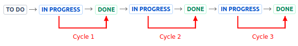 You can choose between: * Display all cycles - all the cycles will be displayed having their own dot in the plotting chart and their own entry in the data table. * Display only the first cycle - only the first cycle of the issue will be displayed, all the others being ignored * Display only the last cycle - only the last cycle of the issue will be displayed, all the others being ignored * Display as one cycle from the start time of the first cycle to the finish time of the last cycle - a single cycle will be displayed, having as start time the moment when the first cycle started and as finish time the moment when the last cycle ended. See the picture below. 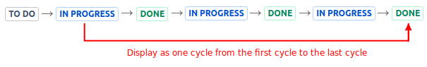 |
| Display data until: | Specify the date until the data is displayed. You can choose between: Previous day (end-of-day) - the data will be displayed until the end of Yestarday, without being necessary to manually enter a date. This date - the data will be displayed until the beginning of the specified date. |
| Interval duration | Specify the duration (in weeks) for the time intervals used when calculating and displaying the average time. |
| Display the data for ? intervals back | Specify the number of time intervals to be displayed in the chart relative to the date specified at "Display data until". |
| Calculate in | Specify in what time unit measure the results will be displayed. |
| Series to Display | Choose what series to display in the chart. You can select one or more options: Average Cycle Time - displays the average cycle time for each time interval from the chart. Trendline - displays a line on the chart that reveals the overall direction of the data. The trendline can be: * Linear - a best-fit straight line that shows if the average cycle time is increasing or decreasing at a steady rate. * Polynomial - is a curved line, determined based an order 2 polynomial formula, recommended when the data fluctuates. |
| Don't count weekends | Check this option if you want to exclude the weekends (Saturdays and Sundays) from the cycle time calculation. |
| Show the Overall Average Cycle Time, calculated as the average of the last ? intervals | Check this option and specify a number of intervals, if you want the chart to calculate and display the overall average. |
| Show legend | Check this option if you want the chart legend to be displayed. |
| Show data table | Check this option if you want a data table to be displayed along with the chart. The Data tab displays, for every time interval in the chart, the issues along with their cycle time details and the average calculation. 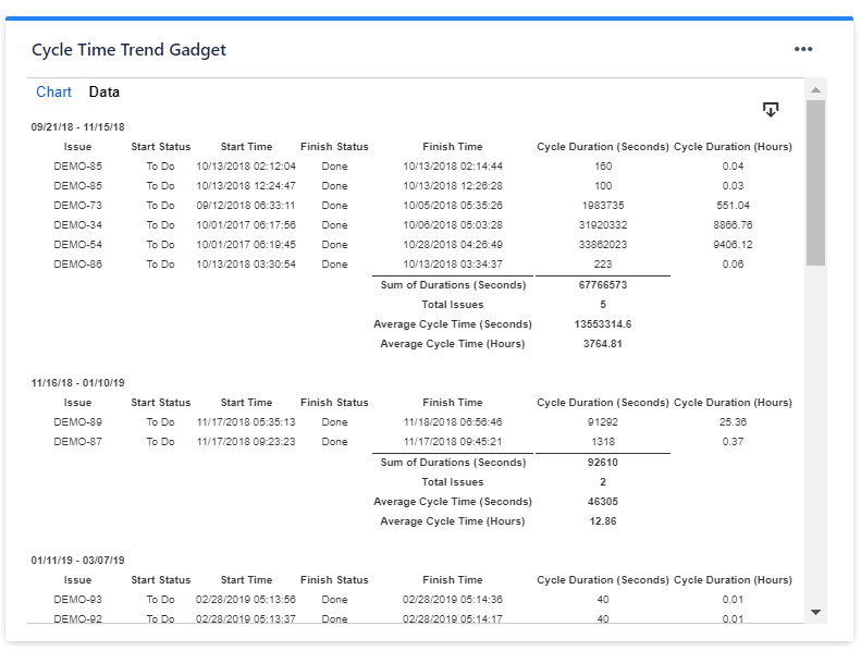 |
| Refresh cached data at next display | This gadget uses data caching for faster display, which means that some data resulted after processing are saved and reused next time when the gadget is loaded. If you check it, the cache of the gadget will be deleted and recreated at the next reloading. This setting is not persistent. |
Related blog articles
- 11 “must-have” gadgets for any Kanban dashboard in Jira
- How to track multi-team or scaled-agile projects (such as SAFe®) in Jira with Great Gadgets app
Control Chart Gadget
Depending on how you configure it, this gadget can calculate the key metrics like "Cycle Time" or "Lead Time" for the issues from a specified filter and for a certain time interval. It shows the issues with their cycle time in a scatter plot chart. Optionally, the average cycle time can be displayed as a separate line and a custom threshold line can be added for easily identifying the issues that had an abnormally long cycle time. In addition, you can choose to display the rolling average line to see the trend and the standard deviation to easily identify the outliers.
You can use this gadget to see how quickly your team delivers and to identify the issues that took longer than expected. Hovering the mouse pointer over an issue in the chart will display a tooltip with the issue details like issue key or cycle time.
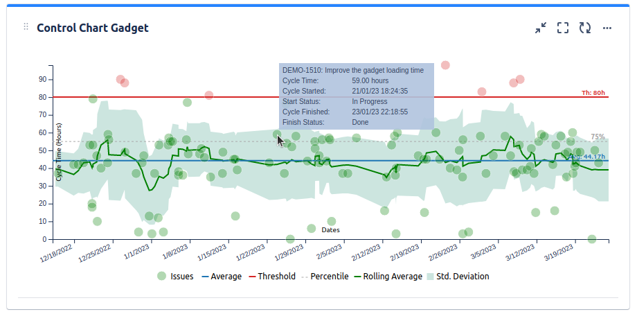
The data is displayed for a specified time interval or an interval relative to the current day. The gadget identifies those issues from the specified filter (or dashboard's filter) that had a cycle completed in this interval, determines the cycle(s) duration and displays them in the chart along with the date when their cycle was ended.
See the settings description below for how to configure the gadget.
Tips
To calculate "Cycle Time", set the following:
* Cycle starts = When the issue entered a status that has category "In Progress"
* Cycle ends = When the issue entered a status that has category "Done"
To calculate "Lead Time", set the following:
* Cycle starts = When the issue was created OR When the issue entered a status that has category "New"
* Cycle ends = When the issue entered a status that has category "Done".
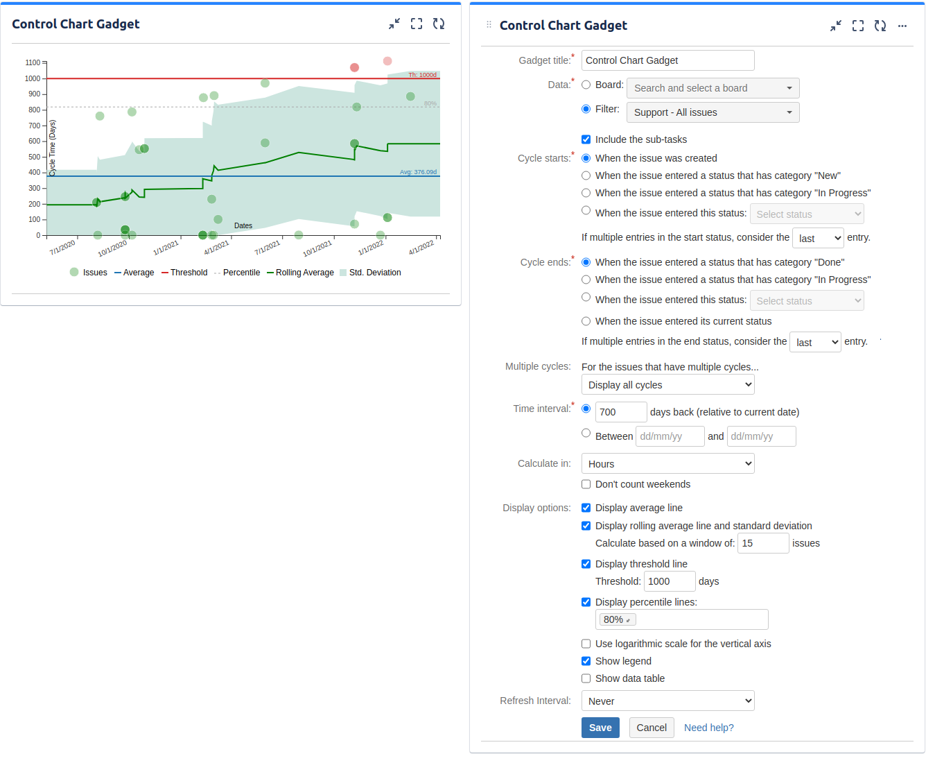
| Setting | Description |
|---|---|
| Gadget Title | Choose what to display in the title bar of the gadget. |
| Data | Choose the board or the Jira issue filter containing the issues for which you want the metrics to be calculated. Make sure that the specified filter is shared with the users who will also visualize this gadget. Check Include the sub-tasks if you want the sub-tasks from the selected board or filter to be included in the calculation. |
| Cycle starts | Indicates what to consider as the start event of a cycle. You can choose between: * When the issue was created * When the issue entered a status that has category "New" - the cycle starts when the issue was transitioned to any workflow status of category "New". This includes those grey-colored statuses from Jira, like New, Backlog or To Do. * When the issue entered a status that has category "In Progress" - the cycle starts when the issue was transitioned to any workflow status of category "In Progress". This includes those blue-colored statuses from Jira, like In Work, In Progress or In Testing. * When the issue entered this status - cycle starts when the issue was transitioned to the specified workflow status. Choose also how to handle the case when there are multiple transitions to the start status or to the status category by setting If multiple entries in the start status, consider the ? entry to first or last. See the example below. Example You configured the gadget to start the cycle When the issue entered a status that has category "In Progress" and to end the cycle When the issue entered a status that has category "Done" and there is a Jira issue that had multiple entries in the "In Progress" status before being moved to "Done". How the cycle time should be calculated, from the first or from the last transition in the "In Progress" status? If you set If multiple entries in the start status, consider the first entry, the cycle will start when the issue was transitioned in the "In Progress" status for the first time. If you set If multiple entries in the start status, consider the last entry, the cycle will start when the issue was transitioned in the "In Progress" status for the last time. |
| Cycle ends | Indicates what to consider as the end event of a cycle. You can choose between: * When the issue entered a status that has category "Done" - the cycle ends when the issue was transitioned to any workflow status of category "Done". This includes those green-colored statuses from Jira, like Done, Resolved or Closed. * When the issue entered a status that has category "In Progress" - the cycle ends when the issue was transitioned to any workflow status of category "In Progress". This includes those blue-colored statuses from Jira, like In Work, In Progress or In Testing. * When the issue entered this status - the cycle ends when the issue was transitioned to the specified workflow status. * When the issue entered its current status Choose also how to handle the case when there are multiple transitions to the end status, by setting If multiple entries in the end status, consider the ? entry to first or last. See the example below. Example You configured the gadget to start the cycle When the issue entered a status that has category "New" and to end the cycle When the issue entered a status that has category "Done" and there is a Jira issue that had multiple entries in the "Done". How the cycle time should be calculated, till the first or till the last transition in the "Done" status? If you set If multiple entries in the end status, consider the first entry, the cycle will end when the issue was transitioned in the "Done" status for the first time. If you set If multiple entries in the end status, consider the last entry, the cycle will end when the issue was transitioned in the "Done" status for the last time. |
| Multiple cycles | Decide how the gadget should handle those Jira issues that have multiple cycles. This situation occurs if the issue was transitioned multiple times through the start and the finish statuses of the cycle. Example You configured the gadget to start the cycle When the issue entered a status that has category "In Progress" and to end the cycle When the issue entered a status that has category "Done" and there is a Jira issue that was moved from "In Progress" to "Done" multiple times, so it has multiple cycles. What cycle do you want to be displayed? You can choose between: * Display all cycles - all the cycles will be displayed having their own dot in the plotting chart and their own entry in the data table. * Display only the first cycle - only the first cycle of the issue will be displayed, all the others being ignored * Display only the last cycle - only the last cycle of the issue will be displayed, all the others being ignored * Display as one cycle from the start time of the first cycle to the finish time of the last cycle - a single cycle will be displayed, having as start time the moment when the first cycle started and as finish time the moment when the last cycle ended. See the picture below. |
| Time interval | Specify the time interval for which to display data. You can specify a fixed time interval or a number of days back relative to the current date, the current day being included. |
| Calculate in | Specify in what time unit measure the results will be displayed. |
| Don't count weekends | Check this option if you want to exclude the weekends (Saturdays and Sundays) from the cycle time calculation. |
| Display average line | Check this option if you want the chart to display a line with the average cycle time for the specified time interval. |
| Display rolling average line and standard deviation | Check this option if you want the chart to display the rolling average line, which allows visualizing the trend, along with the standard deviation that allows identifying the outliers. You must also specify the odd number of X issues representing the window used for calculating the rolling average and the standard deviation. The rolling average and standard deviation are issue-based, not time-based. For every issue shown on the chart, the rolling average and the standard deviation (at that point in time) is calculated by taking the issue itself, X/2 issues before the issue and X/2 issues after the issue, then averaging their cycle times. For example, if you choose to calculate based on 15-issues window, the calculation will be based on the issue itself, 7 issues to the left and the 7 issues to the right. |
| Display threshold line | Check this option if you want the chart to display a line representing a threshold. The issues that have a cycle time higher than the specified Threshold value will be colored in red. |
| Display percentile lines | Check this option and enter the values (percents) corresponding to the percentiles to be displayed. A percentile is a value from the data set that splits the data into two pieces: the lower piece contains the percent of the data, and the upper piece contains the rest of the data. For example the 75% percentile will be displayed as a horizontal line having 75% of the issues under it and the rest of the issues (25%) over it. |
| Use logarithmic scale for the vertical axis | Check this option if you want the chart to display logarithmic scale instead of linear scale for the Y axis. |
| Show legend | Check this option if you want the chart legend to be displayed. |
| Show data table | Check this option if you want a data table to be displayed along with the chart. The Data tab displays the issues along with their cycle time details and the average calculation. 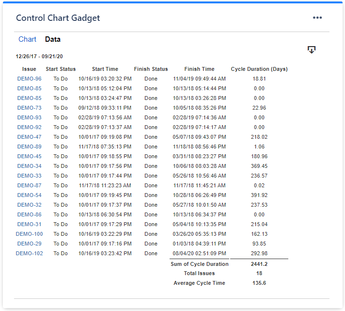 |
Related blog articles
Histogram Chart Gadget
Depending on how you configure it, this gadget can calculate the key Kanban metrics like "Cycle Time" or "Lead Time" for the issues from a specified filter and for a certain time interval and displays their distribution as a histogram. Optionally, the average cycle time can be displayed as a separate line and a custom threshold line can be added for easily identifying the issues that had an abnormally long cycle time.
You can use this gadget to see how your team delivers, how many issues were resolved in the expected time frame and how many were not.
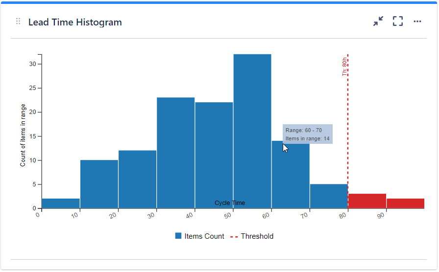
The gadget identifies those issues from the specified filter (or dashboard's filter) that had a cycle completed in the specified time interval, determines the cycle(s) duration and then groups them into "bins" indicating how many values fall into ranges.
See the settings description below for how to configure the gadget.
Tips
To calculate "Cycle Time", set the following:
* Cycle starts = When the issue entered a status that has category "In Progress"
* Cycle ends = When the issue entered a status that has category "Done"
To calculate "Lead Time", set the following:
* Cycle starts = When the issue was created OR When the issue entered a status that has category "New"
* Cycle ends = When the issue entered a status that has category "Done".

| Setting | Description |
|---|---|
| Gadget Title | Choose what to display in the title bar of the gadget. |
| Data | Choose the board or the Jira issue filter containing the issues for which you want the metrics to be calculated. Make sure that the specified filter is shared with the users who will also visualize this gadget. Check Include the sub-tasks if you want the sub-tasks from the selected board or filter to be included in the calculation. |
| Split range criteria | Choose how to define the segmented columns (bins). If you choose Attempt to split in ? equal intervals, the gadget will try to divide the range in equal intervals, although it is not always possible to split in the number of intervals that you specified. So the number that you enter is actually a "desired" number. If you choose Split by using these custom thresholds the range will be divided according to the entered thresholds. In this case, you must manually introduce the thresholds separated by comma (for example: 100, 200, 300, 400, 500). |
| Cycle starts | Indicates what to consider as the start event of a cycle. You can choose between: * When the issue was created * When the issue entered a status that has category "New" - the cycle starts when the issue was transitioned to any workflow status of category "New". This includes those grey-colored statuses from Jira, like New, Backlog or To Do. * When the issue entered a status that has category "In Progress" - the cycle starts when the issue was transitioned to any workflow status of category "In Progress". This includes those blue-colored statuses from Jira, like In Work, In Progress or In Testing. * When the issue entered this status - cycle starts when the issue was transitioned to the specified workflow status. Choose also how to handle the case when there are multiple transitions to the start status or to the status category by setting If multiple entries in the start status, consider the ? entry to first or last. See the example below. Example You configured the gadget to start the cycle When the issue entered a status that has category "In Progress" and to end the cycle When the issue entered a status that has category "Done" and there is a Jira issue that had multiple entries in the "In Progress" status before being moved to "Done". How the cycle time should be calculated, from the first or from the last transition in the "In Progress" status? If you set If multiple entries in the start status, consider the first entry, the cycle will start when the issue was transitioned in the "In Progress" status for the first time. If you set If multiple entries in the start status, consider the last entry, the cycle will start when the issue was transitioned in the "In Progress" status for the last time. |
| Cycle ends | Indicates what to consider as the end event of a cycle. You can choose between: * When the issue entered a status that has category "Done" - the cycle ends when the issue was transitioned to any workflow status of category "Done". This includes those green-colored statuses from Jira, like Done, Resolved or Closed. * When the issue entered a status that has category "In Progress" - the cycle ends when the issue was transitioned to any workflow status of category "In Progress". This includes those blue-colored statuses from Jira, like In Work, In Progress or In Testing. * When the issue entered this status - the cycle ends when the issue was transitioned to the specified workflow status. Choose also how to handle the case when there are multiple transitions to the end status, by setting If multiple entries in the end status, consider the ? entry to first or last. See the example below. Example You configured the gadget to start the cycle When the issue entered a status that has category "New" and to end the cycle When the issue entered a status that has category "Done" and there is a Jira issue that had multiple entries in the "Done". How the cycle time should be calculated, till the first or till the last transition in the "Done" status? If you set If multiple entries in the end status, consider the first entry, the cycle will end when the issue was transitioned in the "Done" status for the first time. If you set If multiple entries in the end status, consider the last entry, the cycle will end when the issue was transitioned in the "Done" status for the last time. |
| Multiple cycles | Decide how the gadget should handle those Jira issues that have multiple cycles. This situation occurs if the issue was transitioned multiple times through the start and the finish statuses of the cycle. Example You configured the gadget to start the cycle When the issue entered a status that has category "In Progress" and to end the cycle When the issue entered a status that has category "Done" and there is a Jira issue that was moved from "In Progress" to "Done" multiple times, so it has multiple cycles. What cycle do you want to be displayed? You can choose between: * Display all cycles - all the cycles will be displayed having their own dot in the plotting chart and their own entry in the data table. * Display only the first cycle - only the first cycle of the issue will be displayed, all the others being ignored * Display only the last cycle - only the last cycle of the issue will be displayed, all the others being ignored * Display as one cycle from the start time of the first cycle to the finish time of the last cycle - a single cycle will be displayed, having as start time the moment when the first cycle started and as finish time the moment when the last cycle ended. See the picture below. |
| Time interval: | Specify the time interval for which to display data. You can specify a fixed time interval or a number of days back relative to the current date, the current day being included. |
| Calculate the cycle time in | Specify in what time unit measure the cycle time will be calculated and displayed. |
| Don't count weekends | Check this option if you want to exclude the weekends (Saturdays and Sundays) from the cycle time calculation. |
| Display average line | Check this option if you want the chart to display a vertical line with the average cycle time for the specified time interval. |
| Display threshold line | Check this option if you want the chart to display a vertical line representing a threshold. The issues that have a cycle time higher than the specified Threshold value will be colored in red. |
| Display percentile lines | Check this option and enter the values (percents) corresponding to the percentiles to be displayed as vertical lines. A percentile is a value from the data set that splits the data into two pieces: the lower piece contains the percent of the data, and the upper piece contains the rest of the data. For example the 75% percentile will be displayed as a horizontal line having 75% of the issues under it and the rest of the issues (25%) over it. |
| Show legend | Check this option if you want the chart legend to be displayed. |
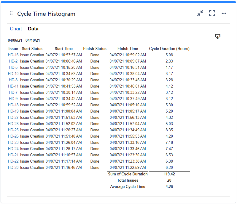
| Show data table | Check this option if you want a data table to be displayed along with the chart. The Data tab displays the issues along with their cycle time details and the average calculation. |
 |
|
Related blog articles
- 11 “must-have” gadgets for any Kanban dashboard in Jira
- How to track multi-team or scaled-agile projects (such as SAFe®) in Jira with Great Gadgets app
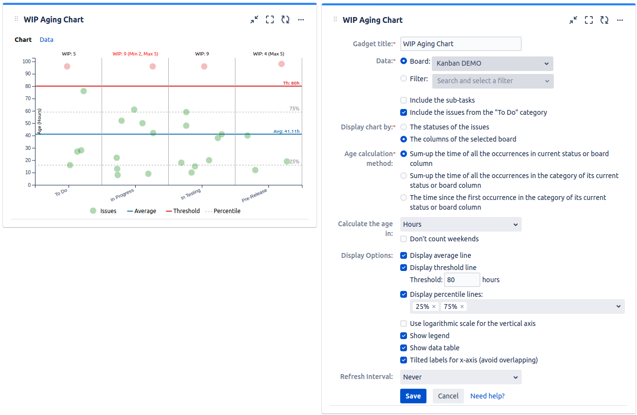
WIP Aging Chart Gadget
Depending on how you configure it, this gadget displays the "work-in-progress" (WIP) issues from a filter or an agile board in a scatter plot chart by their time (age) in their status or board column. Optionally, the chart can display percentiles or the average line. Also, a custom threshold line can be added for easily identifying the issues that have an age (time in status or time in column) higher than expected.
You can use this gadget to easily identify the issues that stay longer than expected in a specific workflow status or board column. Hovering the mouse pointer over an issue in the chart will display a tooltip with the issue details like issue summary or age. If configured to display the columns of an agile board, the gadget displays also the WIP limits of the boards and highlight them accordingly when these limits are exceeded.
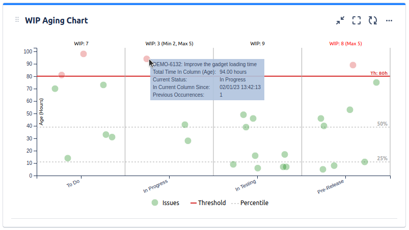
The age calculation method is configurable. The gadget can display a Data tab with more details about every issue displayed in the chart.
See the settings description below for how to configure the gadget.
| Setting | Description |
|---|---|
| Gadget Title | Choose what to display in the title bar of the gadget. |
| Data | Choose the board or the Jira issue filter containing the issues that you want to track in the chart. Make sure that the specified filter is shared with the users who will also visualize this gadget. Check Include the sub-tasks if you want the sub-tasks from the selected board or filter to be included in the calculation. Also, check Include the issues from the "To Do" category if you want the "To Do" issues to be displayed along with the "In Progress" issues. |
| Display chart by | Indicates what the chart displays on its horizontal axis and how the issues are grouped in the chart. The statuses of the issues makes the horizontal axis to display the statuses of the issues. If Data has a Board selected, the horizontal axis of the chart displays the workflow statuses mapped on the "in-progress" columns of the selected board. If Data has a Filter selected, the horizontal axis of the chart displays the "in-progress" category statuses of the issues from the selected filter. The columns of the selected board makes the chart to display on its horizontal axis the "in-progress" columns of the selected board along with their issues. |
| Age calculation method | Specify how the age is calculated, by choosing one of these options: Sum-up the time of all the occurrences in current status or board column - the age is the total time spent in its current status (if the chart is displayed by The statuses of the issues) or the total time spent in its current board column (if the chart is displayed by The columns of the selected board). The previous occurrences are counted. Sum-up the time of all the occurrences in the category of its current status or board column - the age is the total time spent in the category (To Do, In progress or Done) of its current status (if the chart is displayed by The statuses of the issues) or of its current board column (if the chart is displayed by The columns of the selected board). The previous occurrences in the statuses / board columns from the same category as the category of its current status / board column are all counted. The time since the first occurrence in the category of its current status or board column - the age is the total time since the moment when the issue reached the category (To Do, In progress or Done) of its current status (if the chart is displayed by The statuses of the issues) or of its current board column (if the chart is displayed by The columns of the selected board). |
| Calculate age in | Specify in what time unit measure the age of the issues will be displayed. |
| Don't count weekends | Check this option if you want to exclude the weekends (Saturdays and Sundays) from the age calculation. |
| Display average line | Check this option if you want the chart to display a line with the average age for all the issues displayed in the chart. |
| Display threshold line | Check this option if you want the chart to display a line representing a threshold. The issues that have an age higher than the specified Threshold value will be colored in red. |
| Display percentile lines | Check this option and enter the values (percents) corresponding to the percentiles to be displayed. A percentile is a value from the data set that splits the data into two pieces: the lower piece contains the percent of the data, and the upper piece contains the rest of the data. For example the 75% percentile will be displayed as a horizontal line having 75% of the issues under it and the rest of the issues (25%) over it. |
| Use logarithmic scale for the vertical axis | Check this option if you want the chart to display logarithmic scale instead of linear scale for the Y axis. |
| Show legend | Check this option if you want the chart legend to be displayed. |
| Show data table | Check this option if you want a data table to be displayed along with the chart. The Data tab displays the issues grouped by status or board column along with their time spent (age) in their current status or board column for all their occurrences in that status or column. 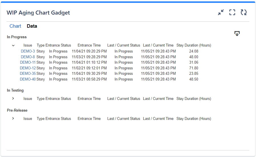 |
Related blog articles
- 11 “must-have” gadgets for any Kanban dashboard in Jira
- How to track multi-team or scaled-agile projects (such as SAFe®) in Jira with Great Gadgets app
WIP Run Chart Gadget
The WIP Run Chart is a type of chart that shows the amount of work in progress (WIP) over time for a team or a process. WIP is the number of items that have been started but not yet finished, or their total estimate, such as the sum of story points.
A WIP Run Chart can help you find trends or patterns in your work process, such as bottlenecks, fluctuations, or improvements. It can also help you monitor and control the WIP level, which is an important aspect of Kanban and other agile frameworks.
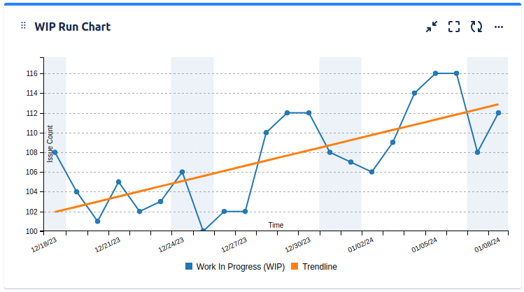
The WIP Run Chart has two axes: the x-axis represents the timeline, and the y-axis represents the WIP count. Each data point on the chart shows the total WIP for a given day or period. The chart can also display a trend line, which can help you identify the direction and rate of change of your WIP level.
NOTE This gadget is only available for the Cloud version of the app.
See the settings description below for how to configure the gadget.
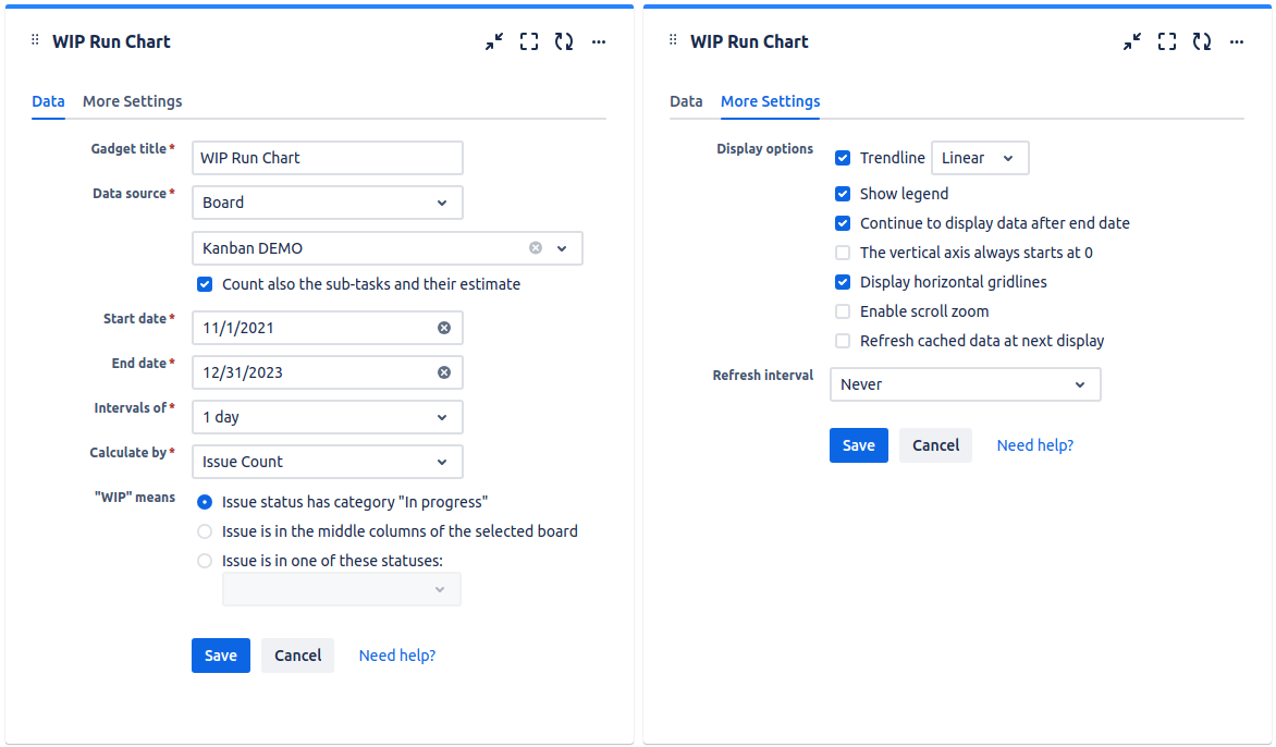
| Setting | Description |
|---|---|
| Gadget title | Choose what to display in the title bar of the gadget. |
| Data source | Select the data source of the gadget. If you select a saved filter, make sure that the filter is shared with a Jira project or My Organization. Check Include the sub-tasks if you want the sub-tasks from the selected board or filter to be included in the calculation. |
| Start date | Specify the start date of the time interval displayed by the gadget. |
| End date | Specify the end date of the time interval displayed by the gadget. Be aware that you can also check the Continue to display data after end date option in the More Settings tab if you want the chart to still display data even if the end date passed. |
| Intervals of | Indicates the length of the intervals displayed on the horizontal axis. |
| Calculate by | Specify on which criteria the calculation to be performed. You can choose between: * Story Points - the default value, use this option if the issues are estimated in Story Points. If the issues are from team-managed projects (aka next-gen projects), select Story Point Estimate instead. * Original Time Estimate - use this if you use time estimates; calculation will be done in hours. * Issue Count - use this if you want the calculation to be done by the number of issues. * Other numerical custom field defined in your Jira instance - pickup the numerical custom field that you use to track or to estimate the issues. |
| "WIP" means | Specify how to consider the issue as being work-in-progress (WIP). |
| Trendline | Check this option to display a line on the chart that reveals the overall direction of the data. The trendline can be: * Linear - a best-fit straight line that shows if the average cycle time is increasing or decreasing at a steady rate. * Polynomial - is a curved line, determined based an order 2 polynomial formula, recommended when the data fluctuates. |
| Show legend | Check this option if you want the chart legend to be displayed. |
| Continue to display data after end date | Check this option if you want the chart to still display data even if the end date passed. |
| The vertical axis always starts at 0 | Check this option if you want the vertical axis to always start at zero. If unchecked, the chart will automatically determine the minimum value of the vertical axis for optimal visibility. |
| Display horizontal gridlines | Check this option if you want the chart to display gridlines for the vertical axis. |
| Enable scroll zoom | Check this if you want to be able to zoom-in while scrolling with the mouse wheel over the chart. |
| Refresh cached data at next display | This gadget uses data caching for faster display, which means that some data resulted after processing are saved and reused next time when the gadget is loaded. If you check it, the cache of the gadget will be deleted and recreated at the next reloading. This setting is not persistent. |
Work Breakdown Structure (WBS) Gadget
This gadget offers the Work Breakdown Structure (WBS) diagram in form of Initiatives > Epic > Parent Tasks > Sub-Tasks for the issues from a Jira filter. The initiatives are those issues defined in Atlassian's Advanced Roadmap app (formerly Jira Portfolio) that are superior to epics in the issues hierarchy. With this gadget you have the high-level status of your epics or the entire project. The issues displayed are ordered according to the ORDER BY clause of the filter used.
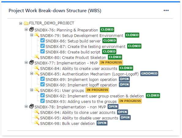
See the settings description below for how to configure the gadget.
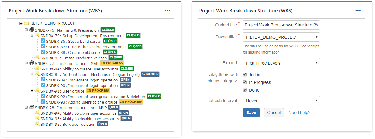
| Setting | Description |
|---|---|
| Gadget Title | Choose what to display in the title bar of the gadget. |
| Saved Filter | The Jira filter containing the Jira issues that you want to display. It can be a filter containing one or more intiatives or epics, or it can be your entire project. Make sure that the specified filter is shared if you want the other people to visualize the dashboard. |
| Expand | Specify how many levels to be expanded by default right after displaying the gadget. |
Related blog articles
Issue Filter Formula Gadget
Calculates and displays the result of a simple formula (like SUM, MAX or AVERAGE) on a numeric field of the issues from a specified Jira issue filter. Use this gadget to display, for instance, the total remaining work or the work done on your project. On Jira Service Management (JSM), you can use it to make calculations based on the Satisfaction field that is set by customers when completing the satisfaction survey after the ticket closure; for instance, you can calculate and display the average Customer Satisfaction (CSAT) of your support team.
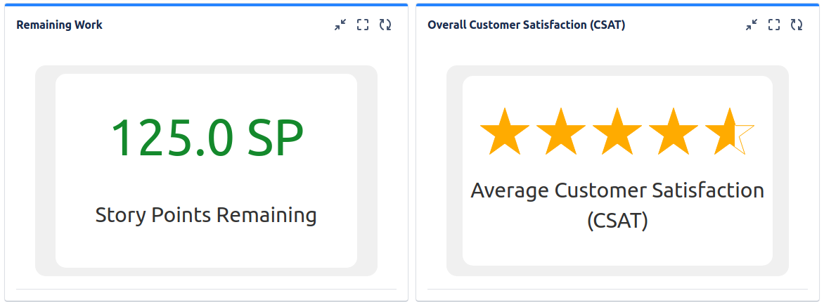
See the settings description below for how to configure the gadget.
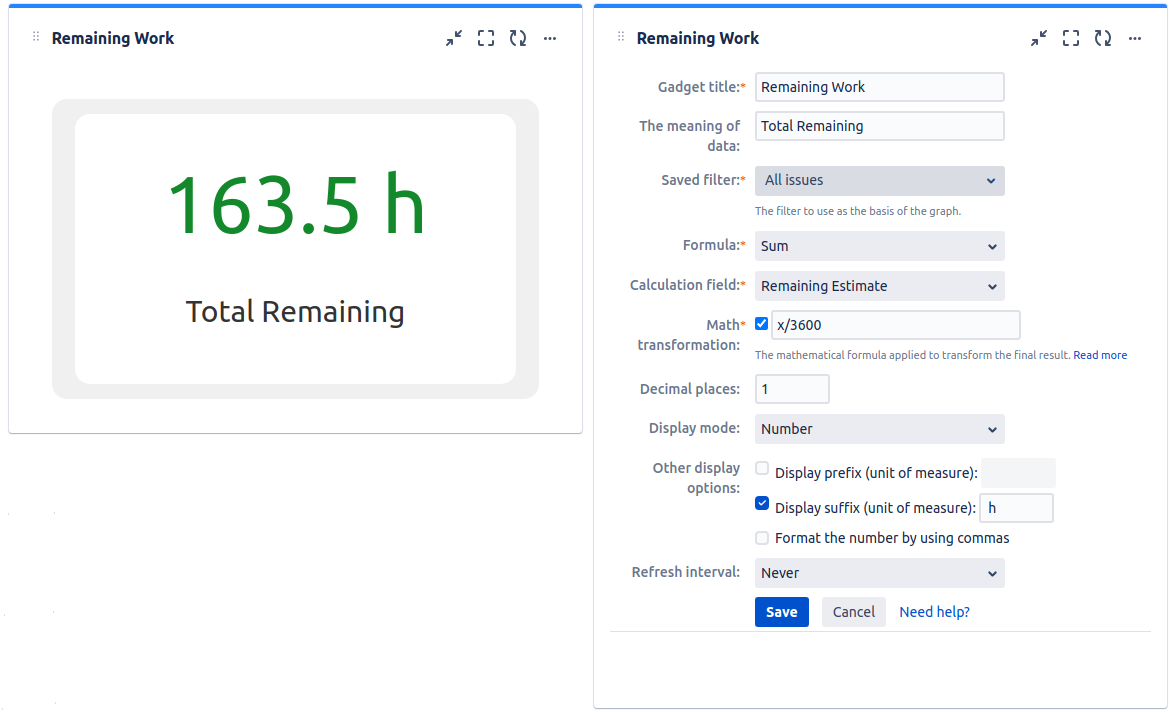
| Setting | Description |
|---|---|
| Gadget Title | Choose what to display in the title bar of the gadget. |
| The Meaning of the Data | Specify the text to be displayed under the calculated value representing the meaning of that value. |
| Saved Filter | The Jira filter containing the Jira issues for which you want to do the calculation. Make sure that the specified filter is shared if you want the other people to visualize the dashboard. |
| Formula | Choose the basic formula (Sum, Average, Min or Max) for being used in calculation. |
| Calculation field | Select the Jira issue field to use for calculation. You can chose from a list of the numeric fields available in your Jira instance. NOTE * On Jira Server and Data Center the scripted fields added via ScriptRunner app are also available for selection here, but only if they are configured as numerical fields in the Custom Fields area of Jira Administration. More exactly, their Search Template must be set to Number Search. * On Jira Service Management, select Satisfaction field to calculate, for example, the average Customer Satisfaction (CSAT), based on the feedback provided by your customers after their ticket is closed. |
| Math transformation | Optionally, you can apply an extra math formula over the result of the basic formula. With this extra math formula practically you will modify the final result with any operation or math function as you want. The formula must contain "x", which represents the result of the initial basic formula. A good example is when you use a basic formula against a time field of Jira, like Original Estimate or Remaining Estimate. Jira stores the values of these fields in seconds and the result of the basic formula will be also in seconds. To transform in hours, you must apply the math transformation "x/3600". |
| Decimal places | Choose the number of decimals to be used when displaying the final result. |
| Display mode | Choose how the result to be displayed. The default option is "Number", which works in all the cases. But, if the gadget was configured to calculate the Customer Satisfaction (CSAT), you could select the "5-star rating scale" option. |
| Display prefix (unit of measure) | Check this option if you want a text representing the unit of measure to be displayed before the calculated value. A prefix like '$' will be displayed in the form of '$8500.50'. |
| Display suffix (unit of measure) | Check this option if you want a text representing the unit of measure to be displayed after the calculated value. A suffix like 'h' will be displayed in the form of '168.8h'. |
| Format the number by using commas | Check this option if you want the calculated value to be displayed with commas. For example: '15300000' will be displayed as '15,300,000' or '5432.1234' will be displayed as '5,432.1234'. |
Related blog articles
- 7 gadgets for a powerful Scrum dashboard in Jira
- 11 “must-have” gadgets for any Kanban dashboard in Jira
Advanced Issue Filter Formula Gadget
This gadget allows displaying the result of up to 6 calculations of math formulas applied against the numerical fields or the count of the issues from multiple Jira filters. Comparing with Issue Filter Formula Gadget, it allows displaying up to 6 calculations results (instead of one) and combines data from up to 6 filters (instead of one) and can do more advanced calculations (not only SUM, COUNT, AVG, MIN or MAX). For example, you could use this gadget to calculate and display the percent of work done or the percent of spent budget.
How it works? The gadget lets you define up to 6 variables ('a', 'b', 'c', 'd', 'e' and 'f') calculated as COUNT, SUM, MAX, MIN or AVERAGE for a numeric field of the issues from a specified Jira issue filter. Then, you can combine these variables in up to 6 math formulas and display their results.
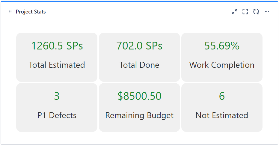
See the settings description below for how to configure the gadget.
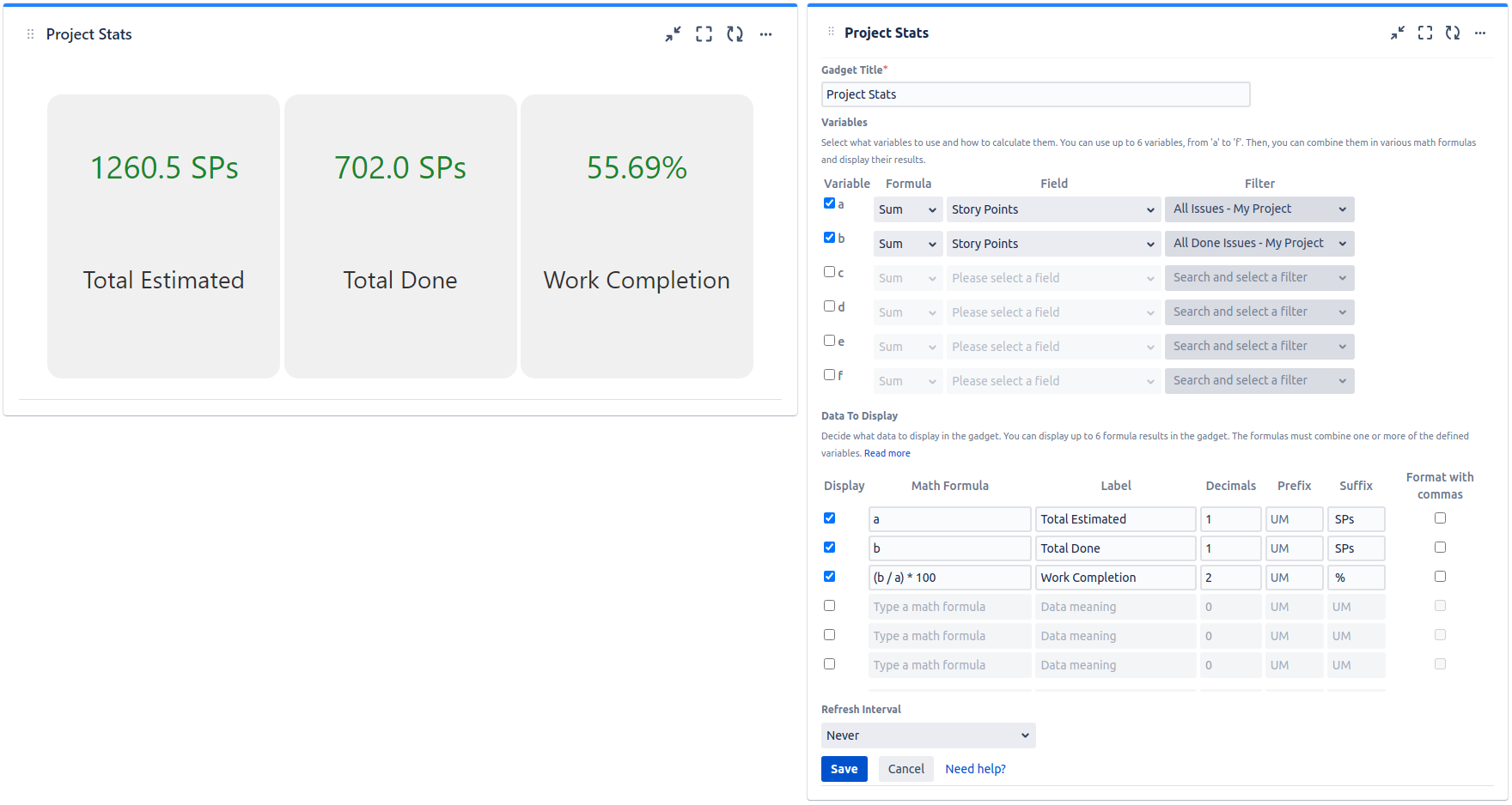
| Setting | Description |
|---|---|
| Gadget Title | Choose what to display in the title bar of the gadget. |
| Variables | Select the variable(s) 'a', 'b', 'c', 'd', 'e' or 'f' that you need and specify how they are calculated. For each of them choose the Formula (SUM, MIN, MAX, COUNT or AVG) that is applied against the selected Field of the issues returned by the selected Filter. NOTE * On Jira Server and Data Center the scripted fields added via ScriptRunner app are also available for selection here, but only if they are configured as numerical fields in the Custom Fields area of Jira Administration. More exactly, their Search Template must be set to Number Search. * On Jira Service Management, select Satisfaction field to calculate, for example, the average Customer Satisfaction (CSAT), based on the feedback provided by your customers after their ticket is closed. |
| Data To Display | Decide what numbers to display in the gadget by entering Math Formulas which combine one or more of the selected variables. For each formula, enter also a Label and specify with how many Decimals the formula result shall be displayed. Optionally, for each value displayed, you can specify a Prefix and/or Suffix of up to 10 chars representing the unit of measure. The prefix, for instance '$', will be displayed before the calculated value (ex. '$8500.50'), while the suffix, for instance '%', will be displayed after the calculated value (ex. '55.69%'). If you check Format with commas, values like '$8500.50' will be displayed like '$8,500.50'. |
Example: Let's assume that you want to display the percent of work done (by story points) for a project. Here are the steps to perform:
- You have to create two filters:
- a filter that returns all the issues from the project.
- a filter that returns only the issues from the project that are done.
- Then, you have to define two variables:
- 'a' that will be calculated as the SUM of Story Points field of the issues from the first filter. This represents the total estimated work, in story points.
- 'b' that will be calculated as the SUM of Story Points field of the issues from the second filter. This represents the total amount of work done, in story points.
- Finally, display the numbers by entering the following math formulas:
- 'a' - to display the value of 'a' variable representing the total estimated work.
- 'b' - to display the value of 'b' variable representing the total work done.
- '(b / a) * 100' - to calculate and display the percent of work done.
NOTE The gadget displays 'NaN' (Not a Number) if the result of the formula cannot be calculated. This can happen in case of division by zero or when one of the variables cannot be calculated (for example, the AVG or MAX for a filter that returns no issues).
Related blog articles
- 11 “must-have” gadgets for any Kanban dashboard in Jira
- How to track multi-team or scaled-agile projects (such as SAFe®) in Jira with Great Gadgets app
Countdown Gadget
This gadget shows the remaining time until an upcoming event. Use this gadget to make your team aware of the remaining time until the next project launch or milestone, the Christmas Party or any other important event for your team or company.
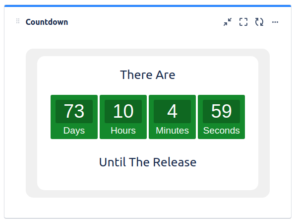
See the settings description below for how to configure the gadget.
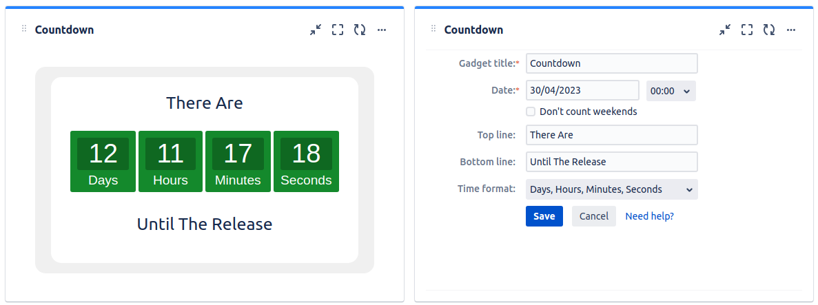
| Setting | Description |
|---|---|
| Gadget Title | Choose what to display in the title bar of the gadget. |
| Date | Specify the date and time for the upcoming event. |
| Top line | The text to be displayed on the line above the remaining time. |
| Bottom line | The text to be displayed on the line below the remaining time. |
| Don't count weekends | Check this option if you want the gadget not to count the weekends (Saturdays and Sundays). This option could be used to determine how many effective workdays remained until a specific milestone. |
| Time format | Choose how the remaining time to be displayed by the gadget. |
Regional Clock Gadget
This gadget shows the current time in a specific location in a digital clock format. It is useful for companies with multiple offices across the world or geographically distributed teams. Use this gadget to make your team members know what the current time is in the other offices so they can better synchronize with the remote people.
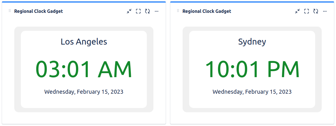
See the settings description below for how to configure the gadget.
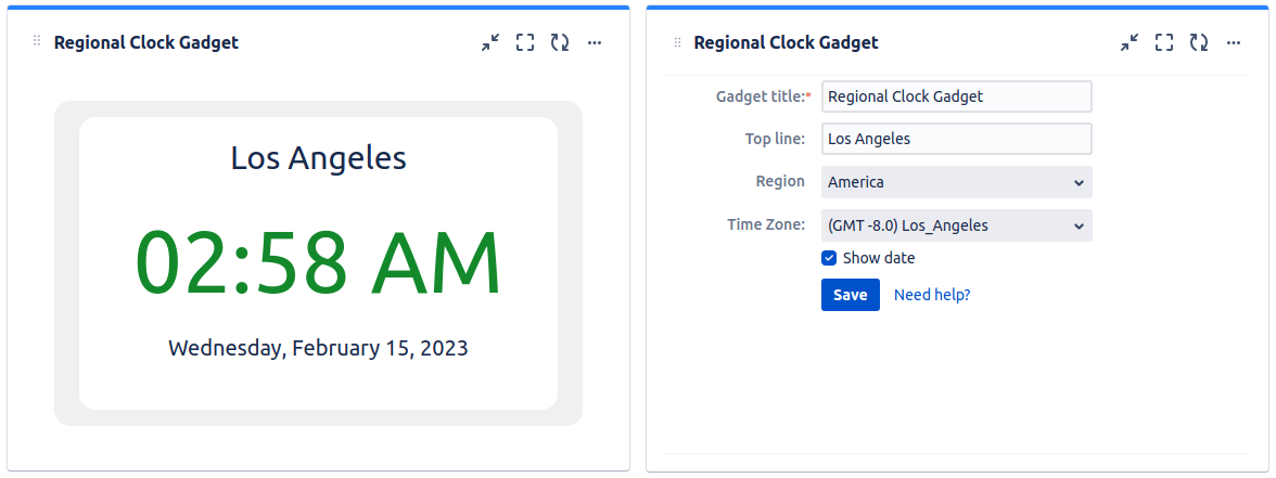
| Setting | Description |
|---|---|
| Gadget Title | Choose what to display in the title bar of the gadget. |
| Top Line | Specify the location for being displayed on the top line. |
| Region | Select the region for which the time to be displayed. |
| Time Zone | Select the city or the time zone for which the time to be displayed. |
| Show Date | Check this if you want the current date to be also displayed. |
Migration Steps
See below some details about migration to Data Center or Cloud. If you have additional questions or need assistance with the app migration, please contact StonikByte Support at support@stonikbyte.com.
Migration from Server to Data Center
If you migrate your Jira instance from Server to Data Center by preserving the existing Jira data, there are no special steps to follow in order to migrate Great Gadgets app. After applying the new Data Center specific license key, the app will continue to work as before.
If you migrate to Data Center without preserving the existing Jira data, this will be like a new app installation. You will have to create new Jira dashboards and configure the app gadgets from scratch.
Migration from Server / Data Center to Cloud
The app has a Cloud version that offers the same functionality as the Server / Data Center version. It can be found on Atlassian Marketplace. If you migrate your Jira instance from Server / Data Center to Cloud, this will be like a new app installation. You will have to reconfigure the app gadgets from scratch. No other migration steps are needed. There is no data to migrate because this app just processes and displays issue-related data taken from Jira.
To determine the gadgets usage in your Jira Server / Data Center instance, you can run this SQL query on the Jira database:
SELECT portletconfiguration.gadget_xml, portalpage.pagename, portalpage.id, portalpage.username
FROM portletconfiguration INNER JOIN portalpage
ON portletconfiguration.portalpage = portalpage.id
WHERE portletconfiguration.gadget_xml LIKE '%com.stonikbyte.great.gadgets%'
This returns a list with the gadget identifier (gadget_xml), the name (pagename) and the identifier (id) of the dashboard where the gadget is located, and the user who added the gadget to dashboard (username).
Rate Limits
Great Gadgets is a reporting application, which by definition works with a large amount of data, so it makes a considerable amount of calls to Jira to retrieve the necessary data. We recommend that you do not enable user rate limits in the Jira or Confluence environment where Great Gadgets is running, as this may slow down the performance of the gadgets in terms of load time and negatively affect the user experience.
But if you still want to set rate limits, note that Great Gadgets recognizes the specific error code thrown by Jira or Confluence when a rate limit is reached, and instead of getting an error outright, will retry up to 30 times at intervals of at least 1 second. If it still fails after these attempts, an error message will be displayed. So make sure you don't set the limit too low.
Updated