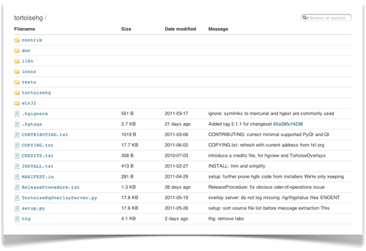
Several of you commented recently when we announced the redesigned "commits" screen, letting us know you appreciate the user interface changes we made. We didn’t stop there, though – we’ve since applied the same treatment to several other repo screens:
File history
- updated the table to use the improved table styling we first used for pull requests
- applied new date formatting, and added title text for those cases where to-the-minute precision is required
Old
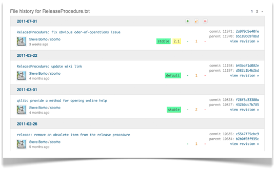
New
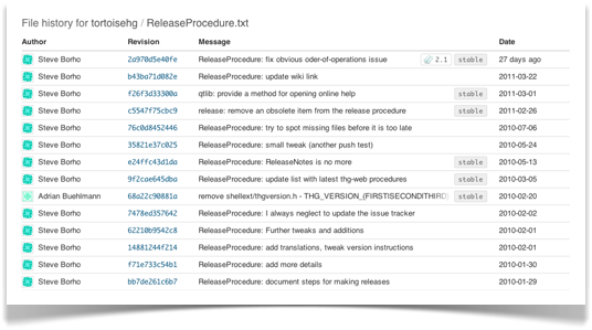
Check out the new file history browser »
Downloads
- updated the tables to use the improved table styling we first used for pull requests
- tags and branches have been put into individual tables
- for repo owners, adding a download is no longer oddly positioned the botton of the page
Old
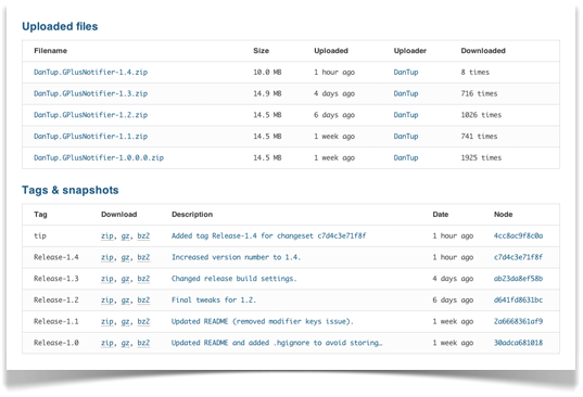
New
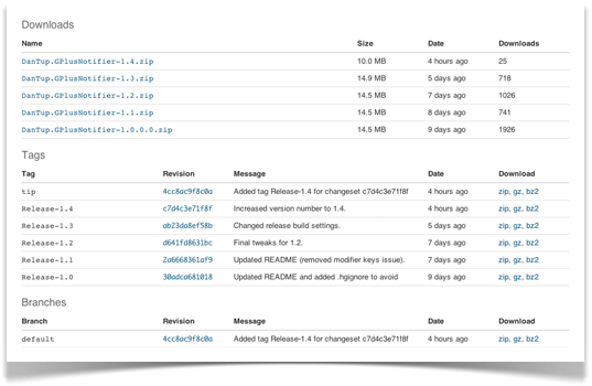
Check out the downloads for the G+ Windows Notifier »
Source view
- monospace font changed to Courier (New), which makes the look and feel similar between different platforms
- applied new date formatting, and added title text for those cases where to-the-minute precision is required
- removed pinstripes, and made other subtle changes to bring the table styling in line with that used elsewhere
Old
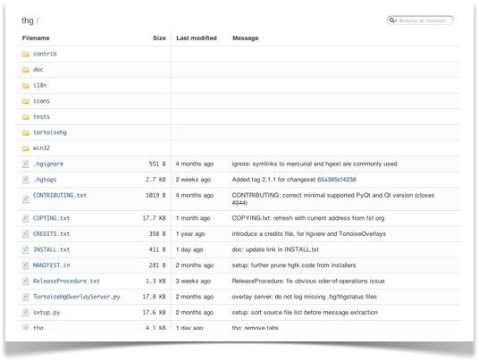
New
